Last year, students in the “Messing About with Maps” class at Park Tudor School learned about their own neighborhoods–and Indianapolis in general–by using SAVI to create data visualizations.
Park Tudor is a private school on the city’s north side. The class, which was conceived and jointly taught by faculty members Adrian Pumphrey and Jane Sidey, served two purposes.
Pumphrey, a math teacher, used it to sharpen students’ understanding of statistics and percentages. Numbers are “far more meaningful when they’re related to their lives,” he says. Sidey, an English teacher, used the data visualizations to teach students to think about maps as narratives that can both reveal and conceal certain stories.
Just by projecting the data onto maps, and asking the students to look at it and come up with their own questions and observations about it–that was much more powerful than a lecture. Because they were really driven by their own interest in it.
Jane Sidey
English teacher, Park Tudor
Pumphrey and Sidey offered the class–which was part of a Park Tudor program that encourages faculty to create their own innovative classes–both semesters in the 2016-17 school year. About 15 seventh and eighth graders took it each semester. At the end, each gave a presentation about their findings.
Students started with their own neighborhoods, but they soon broadened their focus to include nearby neighborhoods and other parts of the city. “SAVI is so great because it can take you down to the street level,” Sidey says. “And then you can spiral out and start seeing other streets and neighborhoods.”
As their focus widened, the students’ questions multiplied, and things got interesting. “Data visualizations have become so rich and powerful in getting across information,” Pumphrey says. “It gives you a lot to talk about.”

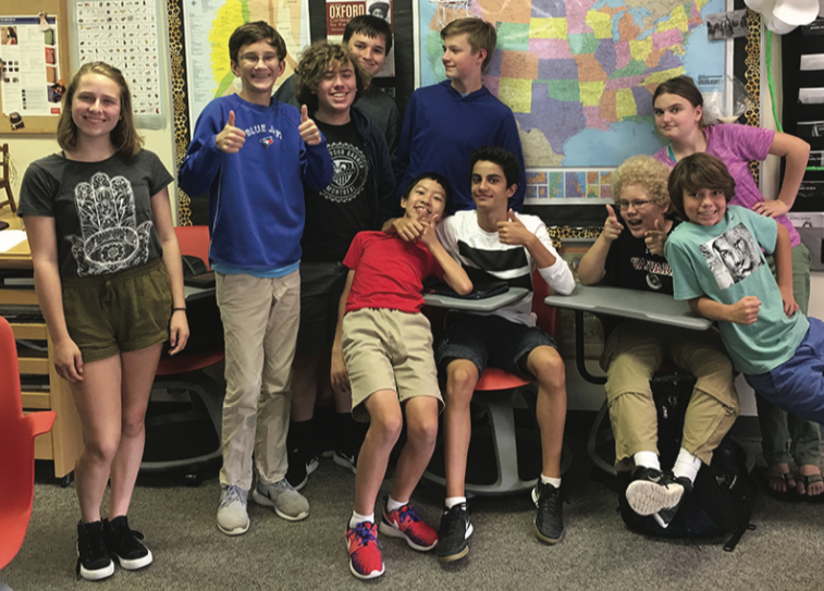
“Messing About with Maps” class participants insisted on a group photo!
“One thing educators talk about all the time is curiosity, and how kids struggle to ask good questions,” Sidey says. “Data visualizations naturally lend themselves to asking questions. Students routinely asked things like, ‘I wonder why the divorce rate is higher here than here? I wonder why this area is much poorer than this area? I wonder why this area has lots of parks and green space?’ I mean, they were curious about everything from criminal records to levels of education.”
Pumphrey and Sidey say their own passion for the project was one key to the class’s success. It “definitely rubbed off on the students,” Pumphrey says.
“We were motivated and interested, and that helped them to be motivated and interested. We didn’t really have to teach,” Sidey says. “Just by projecting the data onto maps, and asking the students to look at it and come up with their own questions and observations about it–that was much more powerful than a lecture. Because they were really driven by their own interest in it.”
One highlight of the first semester was a trip to The Polis Center at IUPUI, where students got to meet the people behind SAVI and ex their new critical-thinking muscles.
“One of the kids actually asked, ‘What is the goal in doing this? What are you hoping to achieve?’” Sidey says. “And that’s a pretty sophisticated question for a seventh or eighth grader to ask: What is your agenda here? I’m not sure a question like that would have been asked if it had been a lecture-based class.”