This is part of our IndyVitals blog series, exploring the data behind IndyVitals.org.
You may be aware that the U.S. has a disproportionately large uninsured population when compared to countries with similar developed economies. While many of these countries have long had nationalized health care services, the U.S. has a deeply ingrained privatized free market system. How to best deal with this gap is certainly a political matter up for debate, but it may be helpful to take a step back and look at health insurance coverage data spatially. The goal of these visualizations is to show what the uninsured population looks like in Indianapolis and to evoke curiosity about what this means and what can be done to change it.
The top map shows the rate of residents without health insurance. Each year shows the average from the 5-year period before (e.g. 2012 would be 2006-2011). The scatterplot shows the relation between median household income, and the rate of residents without health insurance. Color on the scatterplot represents the rate of unemployment.
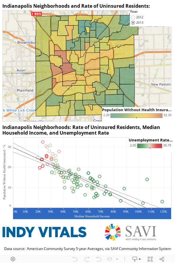
All of these measures are related. Areas with low incomes and high unemployment have higher rates of people without health insurance. Notice the neighborhood areas with the highest percentage of uninsured people was lower in the 2013 report compared to the 2012 report.
Interested in digging deeper? Visit indyvitals.org to explore trends in uninsured populations, median household incomes, and unemployment rates in Indianapolis neighborhood areas for different demographic groups.
Next Up
 Worlds Apart: Gaps in Life Expectancy in the Indianapolis Metro Area
 5 Innovative Ways SAVI is Supporting Public Health
I’m pleased to introduce the health edition of SAVI Online, the second issue of our digital magazine. It features a few of the many ways SAVI is helping improve health […]
 New Trends in Poverty Report Reveals Disparities across Demographics and Neighborhoods
1 out of 5 people in Marion County are in poverty. For a family of 4, that means an annual income of $23,500 or less. Last week, the US Census Bureau released […]
 Drug Free Marion County Uses Maps for Evaluation and Outreach
The Drug Free Marion County initiative contacted SAVI to provide updated data and maps for alcohol and drug-related juvenile crimes in Marion County that highlight the areas with the highest […]