Community Profiles User Guide
1. Getting Started
1.1. Select Your Area

1.1.1. You can choose what kind of area you are interested in, like counties, zip codes, census tracts, and more.

1.1.2. There a few ways to pick an area.
Click on the map.
We’ll highlight the areas you chose, and when you create a profile, you’ll see data about the highlighted areas. You can click an area again to remove it from your selection.

Draw a shape and select areas within that shape.
You can draw a radius around a point, draw a radius around a line, or draw a polygon. Click the buttons below to turn these drawing tools on and off. If you want to adjust your selection, choose “Click Map to Select”. You’ll be back in click mode, and you can select or de-select any area.

Choose an area from a list.
This helps when you want to pick an area by name, and you don’t want to find it on the map. You can pick more than one item from the list.

1.2. See Data About Your Area

1.2.1. Chart View
Chart view is great for looking at change over time. In chart view, the dashboard also has a map available.

Every indicator has its own card.
To start with, we show the latest stat and one chart (usually change over time). Click “more details” to see other charts and demographic breakdowns.
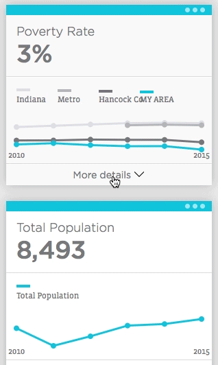
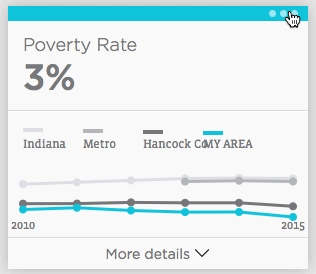
Every card has a menu,
where you can show that card’s data on the map, learn about where and how we got those numbers, download the data, and remove the card from your dashboard.
1.2.2. Table View
Table view shows the latest data we have, broken out by demographic group. Where possible, we compare data for your area, the county your area falls in, the Indy metro, and the state.
Every row is a population group, such as the total population or Hispanic people. Columns show the statistic for each of those groups.
For example, the count column might show the total number of people in poverty, or in the Hispanic roe, the number of Hispanic people in poverty. The percent column, where available, shows the rate for that population group. For example, it might show the percent of the total population in poverty or the percent of Hispanic people in poverty.

1.2.3. Add Data That’s Important to You
Click the plus icon to open the data menu.
Choose indicators right from the list, filter them by topic, or search for indicators using the search box.
The data available to you depends on what kind of geography you chose. For example, some school test score data is available for school districts, but not at the neighborhood level.
