by Jim Dowling | Sep 3, 2014 | SAVI Tools
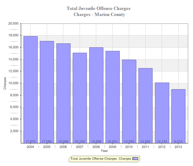
Data visualization is a way to see large amounts of data in one pictorial or illustrative graphic. It helps you to quickly draw attention to key findings/takeaways and observe patterns that are not apparent when looking at data in a table format. There are so many...

by Jim Dowling | Jul 25, 2014 | Uncategorized
By Sharon Kandris The City of Indianapolis, IUPUI, and Lilly Endowment recently announced a $30 million investment to improve IUPUI and the Near Westside neighborhood (See IndyStar story by Erika Smith). Some of the major improvements will include streetscapes, new...

by Jim Dowling | Jun 17, 2014 | Uncategorized
Originally posted on Indiana Nonprofit Summit blog Too often, when I’m working with one of our nonprofit partners, I find that their best stories are not being leveraged to their potential, if they haven’t been overlooked all together. You don’t need someone to...

by Jim Dowling | Jun 5, 2014 | Demographics
We recently came across these interesting maps created by the Pew Research Center showing the changing demographics of the foreign-born population in America. Several media outlets featured these fascinating maps where Pew compared the biggest sources of immigrants...

by Jim Dowling | Apr 17, 2014 | Community Development
“Are there SAVIs in other cities?” is a question that I get occasionally, and the answer is certainly yes. Many community and neighborhood organizations are part of a netowrk called the National Neighborhood Indicators Partnership (NNIP). NNIP is a collaboration of...


