Neighborhood Change 1970-2016
Suburbanization, Gentrification, and Suburban Redevelopment
COMMUNITY TRENDS | SUMMER 2018
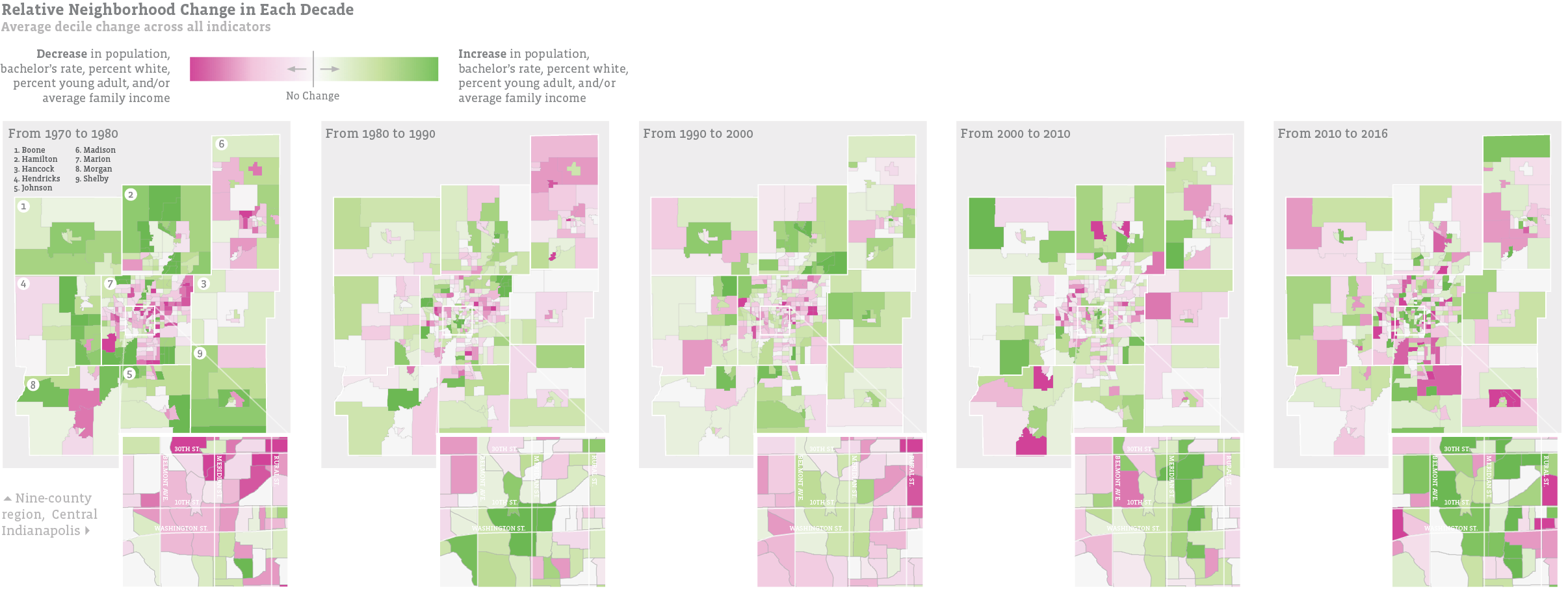
How We Define Change We used five factors to measure neighborhood-level changes across the nine-county region, and measured change relative to other neighborhoods.
Average Family Income (2016 USD). Income is a proxy for measuring neighborhood demand. Higher demand leads to higher housing prices, which will be affordable to buyers with higher incomes. We used average family income because it is available across all time periods and is more sensitive to outliers than median income. Income was inflation-adjusted to 2016.
Population. Population is another useful proxy for neighborhood demand. If a neighborhood is in high demand, more residents may move there, increasing the population.
Percent Age 20-34. Young adults are important to the cultural changes that occur with suburbanization and gentrification. In 1980, 20-34 year-olds were baby boomers. In 2016, they were millennials.
Percent White. Suburbanization and gentrification are closely tied to race. Because whiteness is linked to socio-economic advantage, it can be a signal of neighborhood demand. White population increases in communities of color also can indicate cultural changes.
Percent with Bachelors’ Degree. Education is a socio-economic advantage that may indicate increased demand in a neighborhood. Increased education levels may precede increases in income.
Relative Change. We measured how many deciles a neighborhood changed in each of the factors above. A decile is one-tenth of the neighborhoods, ordered by rank. If a neighborhood moved up or down one decile or more, we considered that change to be significant.
Neighborhoods. We used census tracts as an approximation of neighborhoods. While these boundaries do not usually align with neighborhood boundaries, they are small enough to offer reliable data at approximately a neighborhood scale. In rural areas, tracts are larger than neighborhoods.
From 1970 to 2016, the forces of suburbanization and white flight, followed by the ensuing forces of urbanization, have significantly changed neighborhoods across the Indianapolis region. White, educated, and middle- to upper-income households left the core of Indianapolis in the 1970s. They moved to the outskirts of Marion County and to other counties, enabled by the construction of Interstates 65 and 70 (fully complete by 1974), which made it easier to commute to Indianapolis from suburban areas. Racially discriminatory real estate practices like blockbusting,1 and lending practices like red-lining,2 led white households to leave Indianapolis and prevented black households from moving to new suburban communities.
The current demand for communities with a mix of housing, shopping, and other uses3 has impacted urban and suburban communities differently. In some urban neighborhoods, this demand has translated to increases in the populations that can afford to live there: white, educated, and middle- to upper-income. In some suburban neighborhoods, demand for urbanization has led to the build-out of dense city centers.
Gentrification is broadly considered to be racial and cultural displacement driven by increased housing demand. To examine these trends, we focused on change in five factors that indicate neighborhood demand and may signal cultural changes at the neighborhood level. These five factors include population, young adult share of the population, white share of the population, average family income (in 2016 dollars), and percent of the population with a bachelor’s degree.
It should be explicitly said that this is not a discussion of “neighborhood improvement”. An increase in one of these indicators does not represent an improvement in the neighborhood. These are factors that help us understand cultural changes and changes in demand. Because income, whiteness, and education are advantages in the marketplace, the choices these groups make can indicate real estate demand. Because whites, young adults, high-income families, and college-educated people are often seen as the “gentrifiers”, these indicators can serve as a signal of cultural displacement.
This study uses two methods to reveal important trends in these indicators.
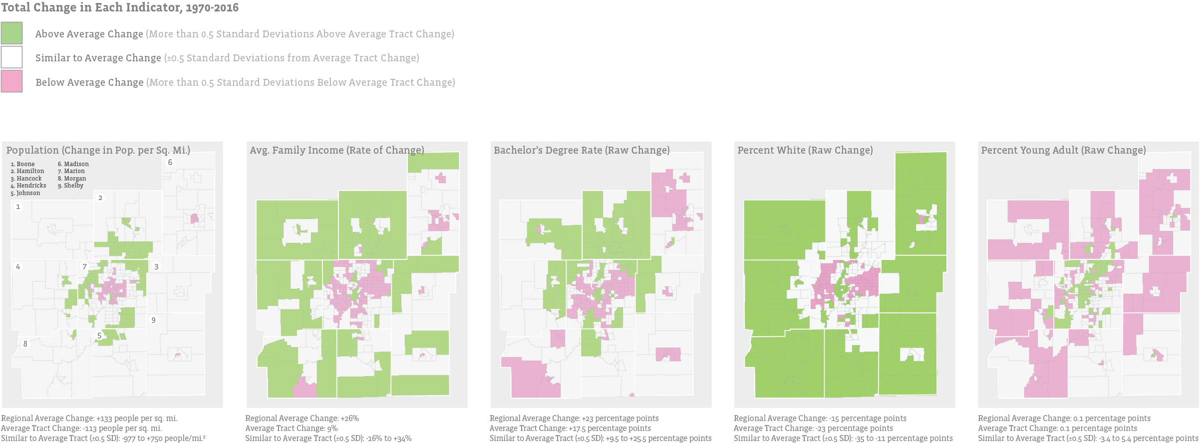
- First, to observe broad trends across the region and the decades, we present two sets of maps. The first shows how neighborhoods changed each decade, using average change across all indicators. The second shows how each indicator changed across the entire 46-year period.
- Second, to observe specific cases, we find six neighborhoods that experienced the most significant single-period change and discuss those trends in detail.
Our Findings
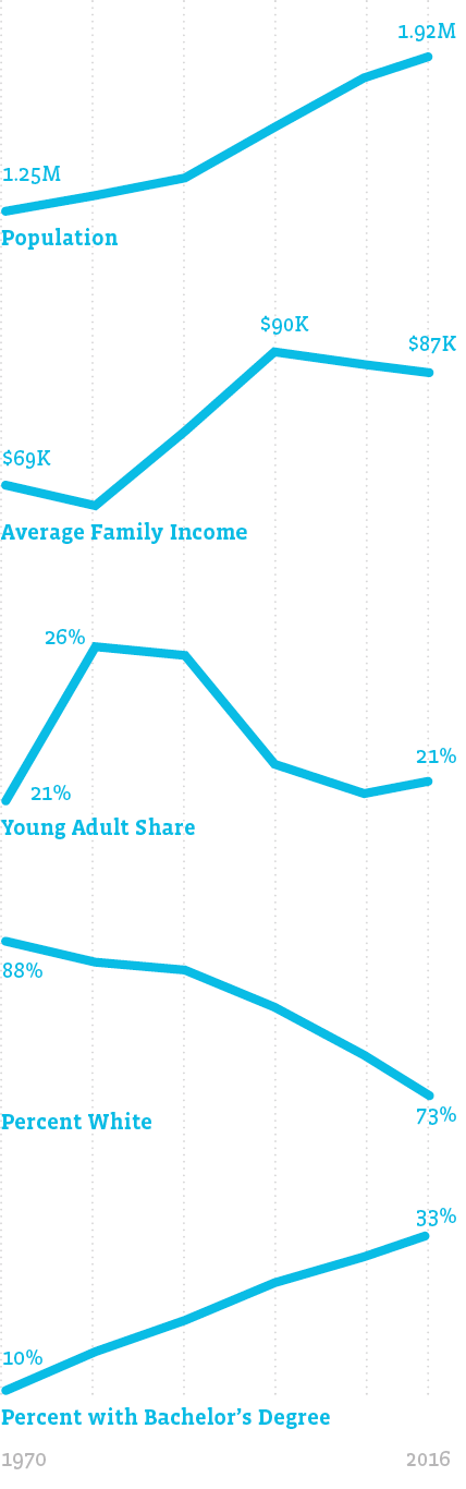
Gentrification in the city center has not offset the declines in population and income that most Indianapolis neighborhoods have experienced since 1970. Half of Indianapolis residents live in neighborhoods with significant income declines, and half live in areas where education gains have not kept pace with the region. Indianapolis has outperformed suburban areas at attracting young adults since 1970, however.
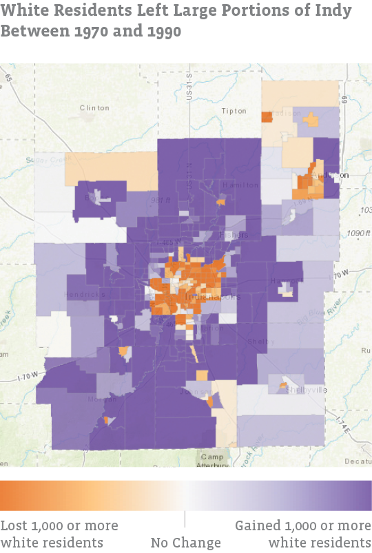
The 1970s were the fastest changing decade in our analysis. White flight and suburbanization drove young, white, educated, and upper-income families out of Indianapolis’ core and older suburbs. Fifty-one census tracts lost 1,000 white population or more in this decade, and 47 of those were in Marion County.
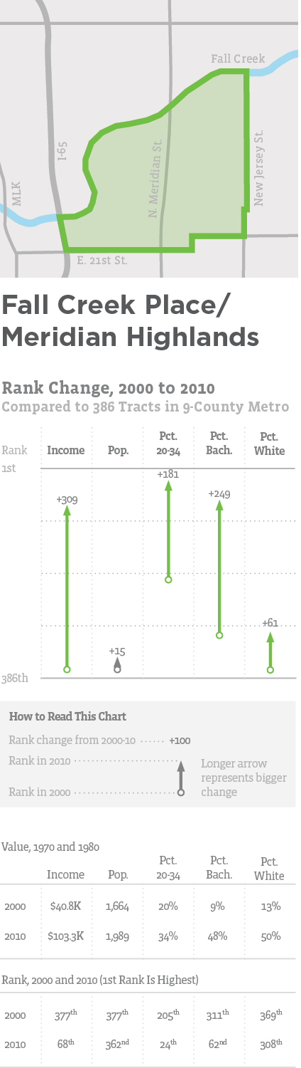
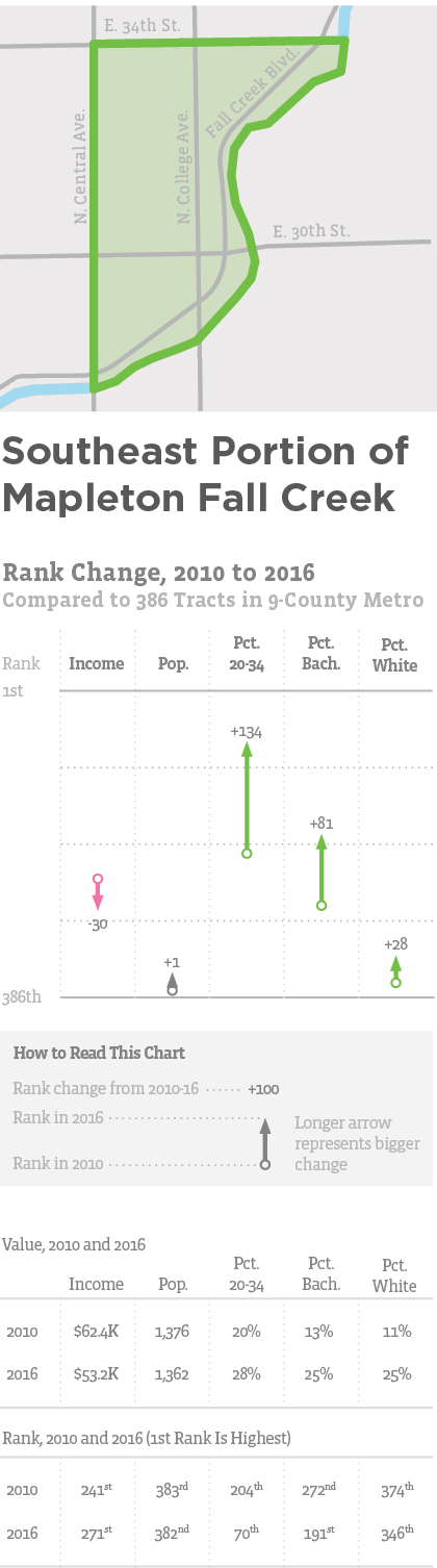
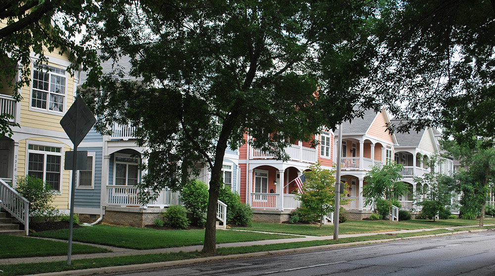
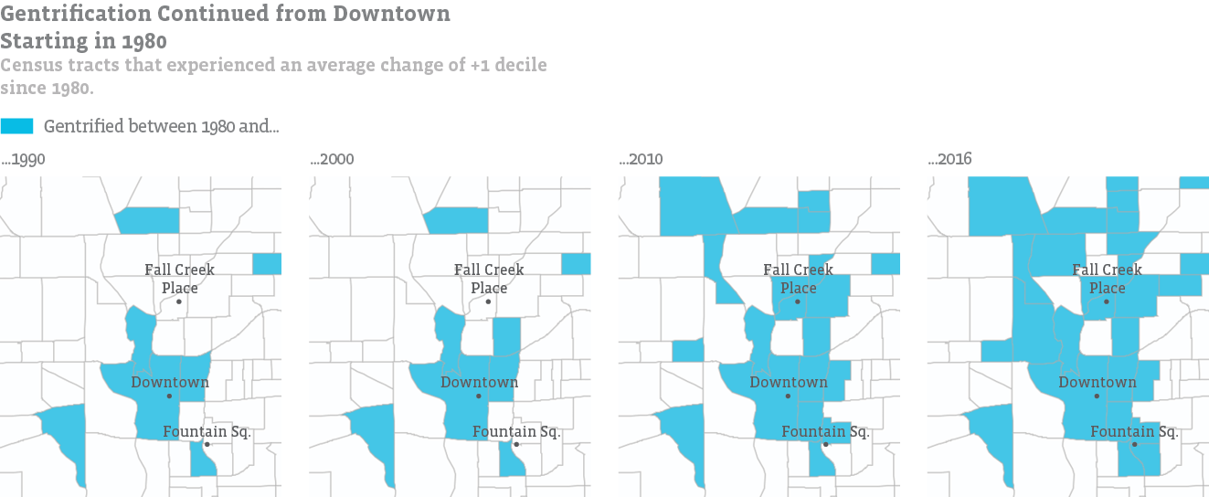
Gentrification began downtown in the 1980s and continued southeast, east, and especially north along College Avenue. Some of the most significant gentrification occurred in Fall Creek Place, where significant public and private investment led the neighborhood to become 3.8 times more white, 2.5 times wealthier, and 5.3 times more college-educated between 2000 and 2010. In recent years, some of the fastest gentrification has occurred in Mapleton Fall Creek, where the neighborhood has become more than twice as white as it was in 2010 and about twice as college-educated. Average family income has increased 42 percent since 1990, while the region’s average has increased only 11 percent.
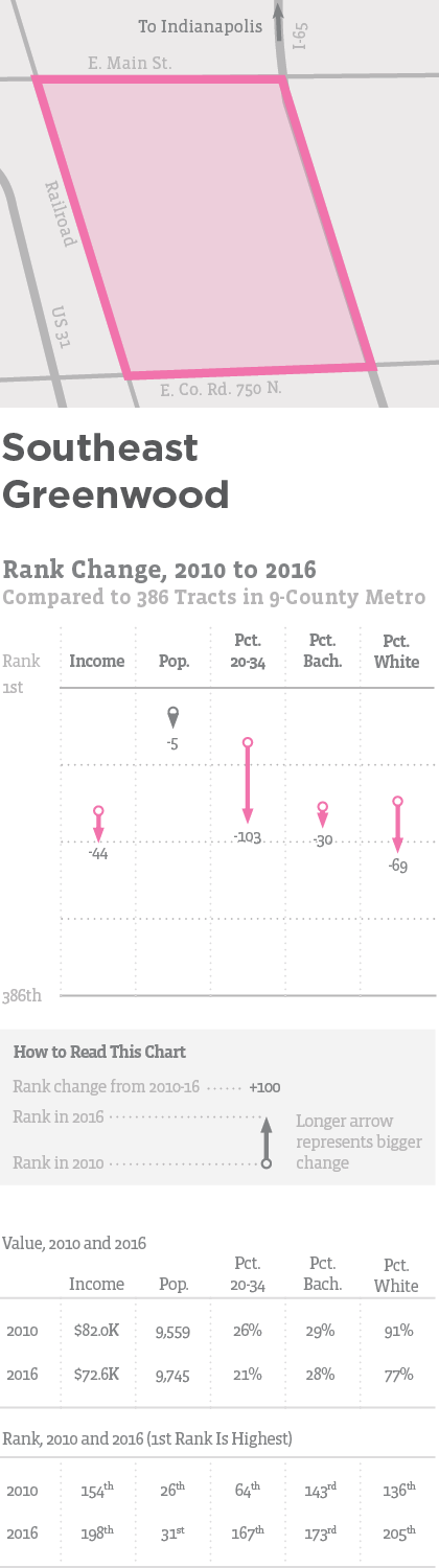
The trend of urbanization has led to the development of dense city centers in some suburbs, while others have seen decreased demand. Downtown Carmel was the region’s fastest changing neighborhood from 2010 to 2016, and much of this is due to significant redevelopment efforts. The area added almost 1,300 residents in that timespan. Alternatively, a neighborhood in southeast Greenwood transformed from 91 percent white in 2010 to 77 percent white in 2016. It fell from one of the highest concentrations of 20-34 year-olds to near the median. The bachelor’s degree rate fell by 3 percent, while the region’s rate rose by 3 percent.
How We Define Change We used five factors to measure neighborhood-level changes across the nine-county region, and measured change relative to other neighborhoods. Average Family Income (2016 USD). Income is a proxy for measuring neighborhood demand. Higher demand leads to higher housing prices, which will be affordable to buyers with higher incomes. We used average family income because it is available across all time periods and is more sensitive to outliers than median income. Income was inflation-adjusted to 2016. Population. Population is another useful proxy for neighborhood demand. If a neighborhood is in high demand, more residents may move there, increasing the population. Percent Age 20-34. Young adults are important to the cultural changes that occur with suburbanization and gentrification. In 1980, 20-34 year-olds were baby boomers. In 2016, they were millennials. Percent White. Suburbanization and gentrification are closely tied to race. Because whiteness is linked to socio-economic advantage, it can be a signal of neighborhood demand. White population increases in communities of color also can indicate cultural changes. Percent with Bachelors’ Degree. Education is a socio-economic advantage that may indicate increased demand in a neighborhood. Increased education levels may precede increases in income. Relative Change. We measured how many deciles a neighborhood changed in each of the factors above. A decile is one-tenth of the neighborhoods, ordered by rank. If a neighborhood moved up or down one decile or more, we considered that change to be significant. Neighborhoods. We used census tracts as an approximation of neighborhoods. While these boundaries do not usually align with neighborhood boundaries, they are small enough to offer reliable data at approximately a neighborhood scale. In rural areas, tracts are larger than neighborhoods.
Wonder how your own neighborhood has changed?
Use our interactive data tool to find out.
Regional Changes
While this report focuses on neighborhood-level change, changes across the nine-county region provide context.
Broad Trends in Each Decade
The decade from 1970 to 1980 was the period of most significant change in our study, though 2010 to 2016 is on track to change almost as significantly.
From 1970 to 1980, much of Marion County saw decreases in demand as whites, high-income households, young adults, and the college-educated moved out of the center-city and older suburbs.
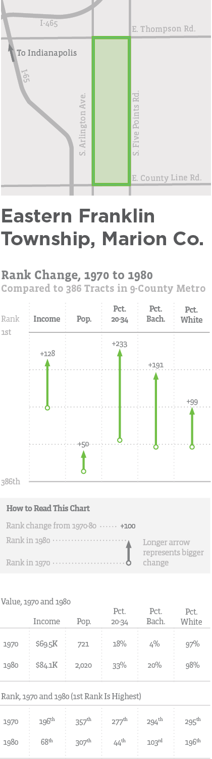
In Marion County, Franklin Township, Decatur Township, and Broad Ripple saw increases in demand among these groups. Outlying counties also saw increased demand, especially Johnson, Shelby, Hendricks, and Hamilton Counties.
Some parts of Indianapolis were relatively stable, such as the Near Southside, Garfield Park, and portions of the Near Eastside.
From 1980 to 1990, these demographics shifts had slowed across the region overall. Downtown and Mass Ave changed significantly in this period. The white share of the population increased slightly, while income, education, and the young adult share of the population increased dramatically.
Geist and Noblesville also increased in demand from 1980 to 1990. Neighborhoods near the Geist Reservoir attracted young adults and households with high incomes and education levels. Noblesville became whiter relative to other areas, and attracted young, educated households with high incomes.
From 1990 to 2000, suburban demand shifted to locations including Southeast Hamilton County, areas north of Brownsburg, northeast Johnson County, and areas in Noblesville and Carmel. Greenfield and Hancock County also saw increased demand among the demographics in our analysis.
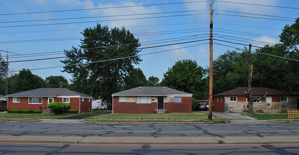
In Marion County, there was growth in Pike Township and Southport. White residents left some Near Eastside neighborhoods that had remained all-white. Some gentrification continued, especially in the Old North Side, where income increased 65 percent, and the number of college graduates tripled.
From 2000 to 2010, Indianapolis saw increased gentrification in Center Township. Fall Creek Place transformed into a high-income, highly educated neighborhood with many young adults. Neighborhoods north along College Avenue and areas just north of 38th Street, became younger, whiter, and wealthier, while the region became more racially diverse and incomes were stagnant.
Gentrification also occurred east and southeast of downtown. Fletcher Place, Fountain Square, Holy Cross, and Cottage Home became whiter, younger, and more college-educated. Incomes were steady in these neighborhoods or increased modestly.
From 2010 to 2016, gentrification continued east and southeast of downtown. Fletcher Place saw average family income double to $218K. In Holy Cross/Cottage Home, income increased 68 percent, and in Fountain Square, income increased 47 percent.
Areas along College Avenue continued to experience gentrification, especially Mapleton Fall Creek, one of the fastest changing neighborhoods in the region. Indiana Avenue near Bush Stadium increased in all five of the demographic factors. Crown Hill became younger while income went up 27 percent, but it remained almost entirely black.
Broad Trends in each Indicator
Indianapolis’ core neighborhoods have declined or had comparitively slow growth in population, income, and educational attainment, while suburban areas have outperformed the region in those indicators. The same trend exists for white residents, but not for young adults. The corridor from downtown Indianapolis north has outperformed the region in attracting residents who are high-income, college-educated, white, or age 20-34.
Population has declined in the core of Marion County since 1970, and grown in the edges of the county and suburban counties. Recent economic growth in some neighborhoods in Center Township has still not led to significant population growth in that area. For example, downtown Indianapolis, Mass Ave, and Fletcher Place, which have gentrified more than almost any other neighborhoods, still have only just recovered decades of population loss. Most other tracts have far fewer residents than they did in 1970. Most of the region has seen growth that is on pace with regional changes. Parts of Hendricks, Johnson, and especially Hamilton County have seen outsized growth.
Moving Out
Average family income has increased in many areas across suburban counties, but in very few neighborhoods in Indianapolis. Geist and northwest Pike Township have seen above average increases, as well Broad Ripple, downtown Indianapolis, and the corridor stretching between them. Overall, 543,000 people live in neighborhoods where incomes have declined by 15.61 percent or more, and 86 percent of those residents live in Indianapolis. In fact, 50 percent of Indianapolis residents live in an area with significant income decline. Among Indianapolis neighborhoods with significant income declines, the average neighborhood lost $27,531 in average family income since 1970.
Education attainment has increased since 1970. One-third of the region has a bachelor’s degree, compared to one-tenth in 1970. However, these increases have largely accrued to surburban counties and the outskirts of Marion County. Ninety-four percent of Hamilton County residents live in neighborhoods where college education rates increased significantly faster than the region. Parts of Indianapolis’ core, including the corridor stretching from downtown Indianapolis to Broad Ripple, have also seen above average change. However, 46 percent of Indianapolis residents live in areas where the college-educated rate has not kept up with regional changes. Morgan, Shelby, and Madison counties have not kept pace.
The region has grown more diverse since 1970, and Indianapolis has changed faster than other areas. White population has fallen on the northeast side, northwest side, and west side. Rural areas have also grown more diverse, but they have not changed at the same pace as the region overall. Suburban areas have grown more more diverse at about the same pace as the region. White share of the population has actually increased in downtown Indianapolis and areas north to 38th Street. These neighborhoods were home to half of the region’s black residents in 1970, but have become increasingly white since 2000.
Mapping Race
Suburbanization and White Flight
The decade from 1970 to 1980 saw more neighborhood change in our five factors than any other period we studied. Much of Marion County lost population, with decreases in income, young adults, white residents, and educational attainment.
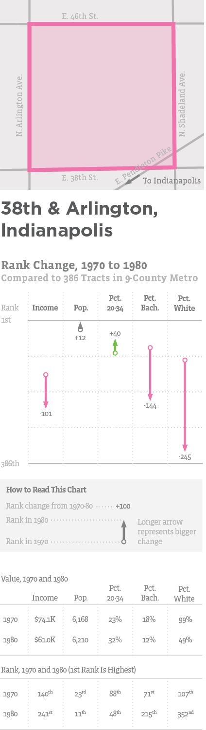
These changes were the result of suburbanization and the exodus of white residents from large portions of Marion County. These trends are illustrated by a neighborhood in Franklin Township, which saw suburban growth driven by white, educated households with relatively high incomes, and a neighborhood just south of Arlington High School, where white population fell by 3,000 residents in a decade.
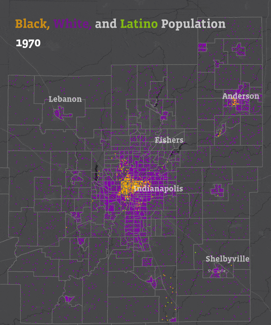
The 1970s witnessed significant change in segregation in Indianapolis, both in where white and black residents lived and where they went to school. In 1970, 49 percent of the region’s 144,000 black residents lived 12 square miles north of downtown Indianapolis. These neighborhoods were roughly bounded by Rural Street to the east, 38th Street to the north, Belmont Avenue to the west, and 10th Street and Interstate-70 to the south.
Throughout the decade, black residents moved to communities north of 38th Street or East of Sherman Ave. These communities were built between 1950 and 1970 and had been nearly all-white in 1970. By 1980, black population fell by 18,782 in the older Northside neighborhoods, but was rising in these northeast developments.
In 1971, the Indianapolis Public Schools (IPS) system was found guilty of racial discrimination and segregation in the assigning of both students and faculty to each school. The court ordered the creation of a plan that would solve this racial discrimination. However, no actions were taken until 1973, when a judge of the Southern District of Indiana ordered a one-way busing of black IPS students to six of the other eight school systems in Marion County.4 Black students were only bused to two of the six required school districts (Warren and Wayne Townships) until the creation of a comprehensive busing plan in 1981. The other four school districts did not comply with the court order.5
As school desegregation was enforced and black residents moved to other parts of Marion County, white residents left by the tens of thousands.6 While the nine-county region’s white population grew by 29,000 between 1970 and 1980, white population fell by 120,000 in Indianapolis’ core and early suburbs.
In the neighborhood at 38th and Arlington, the white population fell by 50 percent. In the neighborhood across Arlington Avenue to the west, 83 percent of white residents left between 1970 and 1980 (a decline of 4,085).
The unification of Indianapolis and Marion County governments allowed the city to receive taxes from wealthier, white communities as they moved to the outskirts of the county. Without this policy change, it is likely that the inequalities that led to wealth disparities between white and black households would have worsened. Without Unigov, Indianapolis would not have had a growing population since 1970. With Unigov, the city has benefited from growth in suburban Marion County.
Suburbs in the 21st Century
Housing preferences have changed in recent decades7, leading to disparate development patterns in suburbs. As demand shifts towards urban environments and away from large-lot suburban development, communities with the resources to develop this real estate product have attracted significant growth. Communities without the resources to invest in redevelopment or without other drivers of demand (such as schools, jobs, and other amenities) have not fared as well.
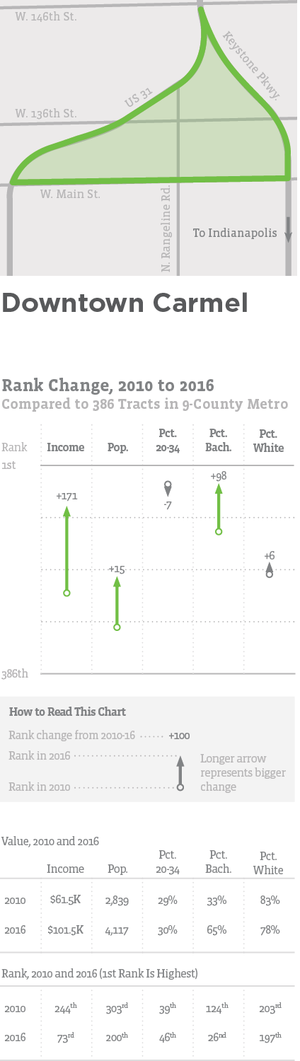
Downtown Carmel illustrates the dramatic changes that can occur when the public and private sectors engage in placemaking. This was the single fastest changing tract between 2010 and 2016. In contrast, a neighborhood in Greenwood saw some of the most dramatic declines in income, share of young adults, and share of whites in that same period.
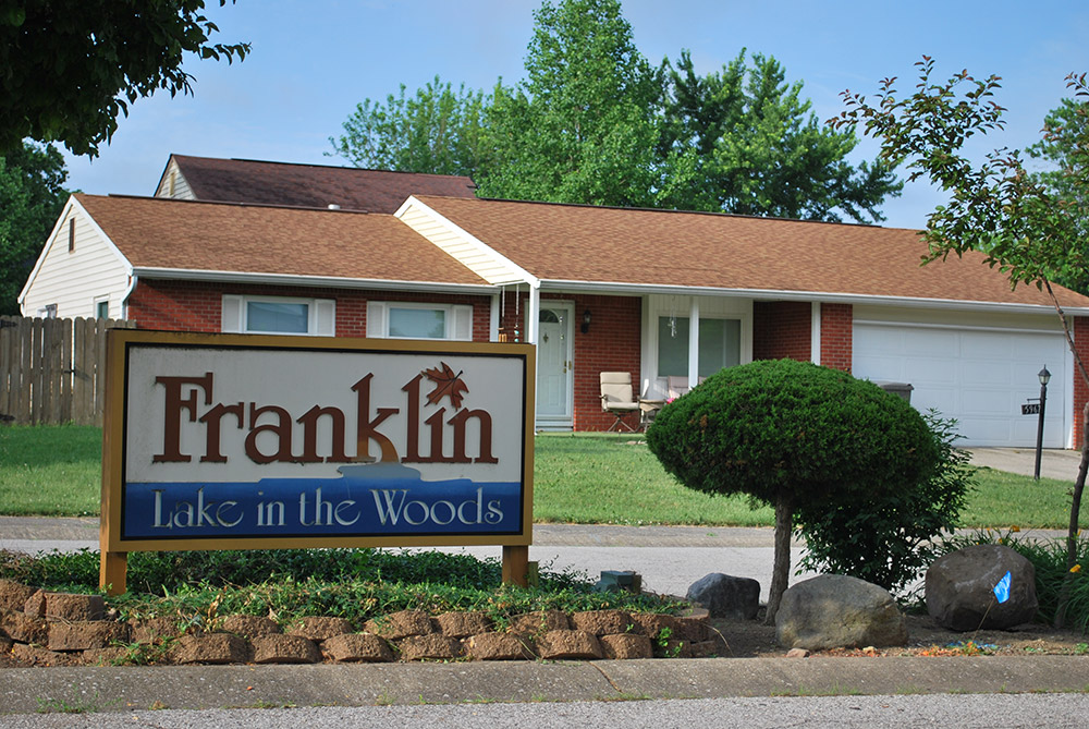
Southeast Greenwood
The area bounded by Main Street to the north, Worthsville Road to the south, Interstate 65 to the east, and the railroad tracks to the west has seen steep declines income, share of millennials, and share of whites in recent years.
Average family income fell from a peak of $93,611 in 2000 to $72,638 in 2016. In fact, in 1980, this area was in the top 20 percent of all neighborhoods in terms of income. By 2010 it had fallen to only the top 40 percent, and by 2016 it was in the bottom half of neighborhoods.
For decades, this area was all-white or nearly all-white, but in 2016, the neighborhood is 23 percent people of color and 77 percent white. The neighborhood lost 1,139 whites from 2010-2016, but still grew on net due to a gain of 1,325 people of color.
In the 1970s and 1980s, this neighborhood, like other suburban areas at the time, was meeting the housing demands of young adults. People age 20-34 increased as a share of the population here, from 25 percent in 1970 to 32 percent by 1990. This number has now fallen sharply. Only 21 percent of the population were millennials in 2016.
Recognizing these trends, the City of Greenwood revealed a $30 million downtown redevelopment plan in the spring of 2017, financed through Tax Increment Financing (TIF) districts, which allow cities to borrow money and repay those loans with increases in property taxes. This financing tool was also used in the redevelopment of downtown Carmel.
Downtown Carmel
In 1970, this tract was relatively wealthy, but sparsely populated. The area was home to 353 residents. Two of them were people of color. The neighborhood was in the top 20 percent of all neighborhoods in average family income, with an inflation-adjusted $85,224 in 1970.
Downtown Carmel has grown steadily since 1970, but growth has increased in recent years. The area added 1,508 residents from 1970 to 2000, but 2,256 from 2000 to 2016. From 1970 to 2010, the neighborhood added an average 62 residents per year. In the next six years, the area added an average 213 people per year.
This tract had some of the fastest increases in education level and income from 2010 to 2016. However, these increases came after steep drops from 2000 to 2010.
The share of the population with a bachelor’s degree fell from 62 percent in 2000 to 33 percent in 2010. It rebounded to 65 percent in 2016. Average family income fell from $141,689 in 2000 to 61,536 in 2010. Some of those losses were recovered from 2010 to 2016, when income increased to $101,521.
The reason for significant decreases in income educational attainment is an open question. These changes may be related to economic impacts from the Great Recession, or from displacement of residents during construction and redevelopment activities.
Some development in this tract was funded through TIF districts. There are seven TIF districts within this area, approved between 2006 and 2010, that have promoted the development of more than 200 residential and commercial properties. Financing from the TIF districts also funded the constructions of police and fire stations, rehabilitation of older buildings, streetscape improvements, and other amenities.8
At the time the TIF districts were created, they had a total assessed value of $106 million. After new development and increased value, these areas have a total assessed value of $278 million. Taxes from the difference (or increment) of $172 million are available to finance the development and other improvements.
Gentrification
The same demand for urban real estate that led to substantial public and private investment in placemaking in downtown Carmel has also led to gentrification in the urban core.
1980s. After the decline of the urban core in the mid-twentieth century, small portions of Indianapolis began to gentrify. Downtown, average family income doubled between 1980 and 1990, from $32,103 to $71,881. The average income of Mass Ave and Chatham Arch more than tripled in that decade, from $27,985 to $91,189 in 1990.
Both areas jumped from well below the median education level to the top third of all neighborhoods. In the decades following 1990, the neighborhoods experienced dramatic declines in vacancy rates and growth in white population. Downtown went from 51 percent white in 1990 to 71 percent white in 2016.
1990s. The Old Northside gentrified in the 1990s. Black population declined by 2,001 from 1980 to 2010, while white population rose by 531. Average family income tripled from 1990 to 2010.
2000s. Between 2000 and 2010, gentrification spread southeast, east of Interstate 65/70, and north along College Avenue. In Fountain Square, average family income rose modestly, but the education level and the young adult share of the population rose dramatically. In Holy Cross and Cottage Home, the young adult share of the population almost doubled, while education rates rose from the bottom third of neighborhoods to above the median.
Fall Creek Place gentrified significantly between 2000 and 2010. The neighborhood changed faster than almost any other neighborhood in any decades. In 2000, one-tenth of residents had a bachelor’s degrees. A decade later, half the neighborhood had a bachelor’s degree. Average family income jumped from $40,750 to $103,339 in ten years.
This change was driven by a massive public and private partnership between the City of Indianapolis, the U.S. Department of Housing and Urban Development (HUD), King Park Area Development Corporation, and Mansur Real Estate Services. The project received a $4 million Home Ownership Zone grant from HUD in 1998, as well as $7.5 million in Community Development Block Grant funding and $3.8 million in HOME Investment Partnership funding since 1996. Just over half of the 313 residences completed in this project were sold to low- to moderate-income households.9
2010s. Gentrification continued to spread along College Avenue from 2010 to 2016, including Mapleton Fall Creek, which was one of the fastest changing neighborhoods in recent years. Relative to other neighborhoods, Mapleton Fall Creek increased significantly in three factors: millennial share of population, percent of population with a bachelor’s degree, and white share of the population. Three percent of the neighborhood was white in 2000. By 2016, the neighborhood was 25 percent white. While income fell between 2010 and 2016, it is has still grown 13 percent since 2000.
Conclusion
Most of Indianapolis’ core neighborhoods have lost population, experienced significant income declines, and not kept pace with the region’s increased educational attainment.
Since 1970, average family income grew by 26 percent across the region, but half of Indianapolis residents live in neighborhoods where incomes fell by more than 15.6 percent. And while the region has grown in population by 54 percent since 1970, Center Township has lost almost half of its residents in that period. The share of the population with a bachelor’s degree has increased from ten percent in 1970 to 33 percent in 2016, but half of Indianapolis residents live in neighborhoods that have not kept paced with these improvements. (These neighborhoods experienced a increase of 9.5 percentage points or less.)
Some gentrifying neighborhoods near downtown and north along the Meridian/College corridor are growing faster than the region in terms of income and bachelor’s degree rates. These areas are also attracting young adults and white residents at a faster rate than the region. However, these demographic changes have not nearly reversed population losses. Downtown, Mass Ave, and Fletcher Place grew by a combined 3,200 since 1970, but most other gentrified neighborhoods still have a fraction of the population they once had. Many neighborhoods reversed their population declines (especially between 2010 and 2016), but it remains to be seen if they can restore population levels they had decades ago.
Defining gentrification with a broader mix of economic and social variables affirms stories of significant neighborhood change not seen in typical indicators.
Neighborhoods that are anecdotally said to be gentrifying often do not immediately reflect this through high incomes. While this could be used to counter claims of neighborhood change, our analysis supports these claims in three ways. By using demographic factors other than income, gentrification becomes evident in neighborhoods such as Fountain Square or Mapleton Fall Creek. Here, white, young, and college educated populations are rising, but average family income is not.
Second, using average family income instead of median family income is more sensitive to upper outliers. In 2010, Fall Creek Place’s median household income was $44,000, about the same as Marion County. But, its average family income was $103,000, more than double what it was in 2000.
Third, we analyzed change in neighborhood rank rather than absolute values. This revealed significant changes that may have been otherwise missed. For example, while Mapleton Fall Creek is only 25 percent white, that share has increased 733 percent since 2000. Or, even though Fountain Square’s bachelor’s degree rate is much lower than the region (22 percent versus 33 percent), it has increased 450 percent since 2000. Across the region, bachelor’s degree rate increased 27 percent in this period.
Public investment in suburban downtown redevelopment is commonly seen as a necessary approach to vie for residents attracted to the suburbs in past decades.
Our analysis brings Greenwood and Carmel to the forefront as two case studies, but they are examples of a broader trend. There are 22 neighborhoods that experienced a significant average increase in relative population, bachelor’s degree rate, white population, young adult population, and income (an average decile change of at least one) between 2010 and 2016. Three quarters of these were inside the I-465 loop. There were 16 neighborhoods with the opposite trend, and half of these were outside the I-465 loop.
Outside of Indianapolis, the only areas that have outpaced the region in attracting young adults since 1970 are downtown Carmel, Fishers, Noblesville, Anderson, and Shelbyville.
Carmel stood out as experiencing dramatic relative increases in income, population, and bachelor’s degree rate after a large public investment in its downtown. Greenwood experienced significant relative decrease in income, bachelor’s degree rate, white population, and young adult population, but announced plans for a $30 million downtown redevelopment in 2017. TIF financing played a key role in Carmel’s efforts and Greenwood plans to use that funding mechanism as well.
The City of Fishers has also used this financing mechanism to redevelop their downtown, called the Nickel Plate District. The census tracts around the district have not experienced dramatic changes in our indicators since 2010, but this could be because of the geography of those census tracts. The tract that we call “Downtown Carmel” is small enough that it is sensitive to demographic changes from redevelopment. Downtown Fishers is divided into three tracts, which are large and contain many different kinds of development, from highway commercial districts to suburban tract development. Therefore, these tracts are not as useful as a natural experiment.
Further Research Questions
In many neighborhoods that have seen gentrification since 1980, not all indicators increased simultaneously. For example, in downtown Indianapolis and increases in young adults, college educated residents, and incomes were followed a decade or two later by increases in overall population and white population. It would be worthwhile to understand if some of these demographic factors are leading indicators of gentrification, and there is some statistically verifiable pattern of change in these neighborhoods.
Historical and ethnographic research is possible at the neighborhood scale, to better understand these demographic trends in the context of historical events and individual experiences. What public and private investments induced change in a given neighborhood? What are the residents’ experience of this change?
The “suburbanization of poverty” is a common concern when considering the impact of central-city gentrification. If the center city, with its close access to jobs, health care, retail, services, and transit, becomes increasingly the home of upper-income households, then lower-income income residents may migrate to more affordable areas with less access to economic resources and amenities.
This current analysis could a be a starting point to review that question and discover to what degree that is the case in Indianapolis. Our study does show some areas in suburban counties that experienced declines in the five socio-economic indicators from 2010 to 2016. However, the most dramatic declines tended to take place in Marion County neighborhoods. (In general, Marion County neighborhoods tended to experience the most volatility in either direction in recent years.)
Policy questions emerge from these changes, such as: How can planners, developers, and community leaders hear the desires of community members and enact equitable place-based solutions? What is the role of place-based solutions in addressing the wealth and income inequities between white residents and people of color? How do low-income communities and communities of color envision quality of life? How can planning and policy solutions involve these communities in partnership and through delegated power, rather than simply consultation?
There are hopeful efforts underway through strategies like community-based planning, which is a framework that guided the City of Indianapolis in its planning efforts for Sherman Park, the former site of an RCA plant on Indianapolis’ Near Eastside. Community land trusts may also offer another avenue for redevelopment that directly benefits those who are in need. By retaining community ownership of some properties during redevelopment, communities can maintain affordability and even build equity for current residents.
Find more interactive content from our series on neighborhood change.
No Results Found
The page you requested could not be found. Try refining your search, or use the navigation above to locate the post.
Methodology
This analysis focused on change in neighborhood demographics using a few key census indicators, measured between 1970 and 2016, for the nine-county10 Indianapolis area. Using ten-year intervals11, we looked at major demographic shifts that occurred in small, neighborhood areas12, and contextualized relevant social and cultural transformations that may have influenced those demographic shifts.
Theory of Measuring Neighborhood Change
Our approach is informed by a straightforward method of measuring “significant change” at the neighborhood level, as analyzed by J.D. Landis.13 Landis looked at the decile change of various census indicators between 1990-2010, assuming that a two-decile change within that twenty year timespan indicated a “significant change”14 in one direction or another. Prior to Landis’ analysis, previous work by William Lucy and David Philips15 used census data to look at change in urban areas versus change in suburban areas16. Lucy and Philips developed an accessible, replicable approach based on a few key census indicators as good markers for neighborhood change, including demographics, income, housing, education, and employment.17 In this analysis, we selected indicators consistent with perceived gentrification and neighborhood displacement, since those concepts best capture what the general population often thinks of when they consider neighborhood change. To examine these trends, we focused on change in indicators that may reflect neighborhood demand and signal cultural shifts at the local level. The indicators used in this analysis were:
- Total population
- Percent of white (non-Hispanic) population
- Percent of population over age 25 with a Bachelor’s degree or higher
- Percent of population between ages 20-34
- Average family income (inflation-adjusted)18
We collected data using the Neighborhood Change Database (NCDB) which crosswalks and normalizes historical census data to 2010 census geographies.
Analytical Approach
For the beginning and end years in each interval (e.g., 1970 and 1980), we identified the decile for each indicator for each tract and determined the change in the decile of the earlier year compared to the more recent year. In other words, we subtracted the more recent year’s decile from the older decile. We then took the average of the decile changes across the five indicators to produce an “average change” value. These values were then sorted into categories of significant and nonsignificant change, then mapped. We considered “significant change” to be the increase or decrease of 1.4 deciles in average change in a given time increment.19 Once mapped, we investigated trends in the data and identified neighborhood areas that were most representative of broader, regional trends. Three distinct phases of neighborhood change (white flight, suburbs in the 21st Century, and gentrification) were identified, then further explored through the lens of selected neighborhood areas. In an effort to contextualize the potential underlying causes for each phase of change, our additional research included major historical events, urban planning initiatives, and (re)development programs. Although only six neighborhoods were highlighted in this report, they are intended to represent larger neighborhood groups and are not the only neighborhoods in the region that have undergone significant change. Furthermore, other definitions of neighborhood change, using indicators other than those selected for this analysis, will undoubtedly yield different results than those presented in this report.
End Notes
- Orser (2015) BACK ▲
- Indiana Legal Archive ▲
- Metropolitan Indianapolis Board of Realtors (2013). This Consumer Preference Survey found that for 44 percent of residents’ desired an urban or mixed-use neighborhood. ▲
- Moore (2011) ▲
- Denne (2017) ▲
- Zeigler (1994). There is also a neighborhood history at The Polis Center’s Project on Religion and Urban Culture. ▲
- Metropolitan Indianapolis Board of Realtors (2013) ▲
- Indiana Business Research Center (2018) ▲
- Fall Creek Place Homeowners Association (2015) ▲
- Two Indianapolis metropolitan area counties (Brown and Putnam) were excluded due to data inconsistencies. ▲
- The increments are 1970-1980; 1980-1990; 1990-2000; 2000-2010; and 2010-2016. ▲
- In this analysis, census tracts are used because of their close approximation to neighborhood-sized areas. Data is readily available at this geographic level, meaning minimal processing is necessary to generate an aggregated statistic for a given area. ▲
- Landis (2015) ▲
- Landis was interested in developing a measure for gentrification and neighborhood decline. ▲
- Lucy and Philips (2006) ▲
- Because Lucy and Philips, and later Landis, were interested in looking at many cities across the United States, and were in particular interested in asking whether cities had different experiences of change than suburbs, they used approaches that separated urban and suburban/rural areas. We are counting the entire area as one region in our analysis. ▲
- We do not use each indicator used by Landis or Lucy and Philips because we are not necessarily looking at predictors of change or the effects of settlement patterns on future change. ▲
- The family income indicator was collected for all years in this analysis, where median or average household income were not. Indicators such as poverty level were not used because of their correlation with income. ▲
- We settled on 1.4 deciles in either direction after looking at several breaks in the data. An average change of two deciles often showed no tracts (even though we may suspect that change was indeed occurring in some neighborhoods). One decile of average was not easy to defend this as “significant” change. ▲
References
Denne, Rebecca. (2017). Inequality Remade: Residential Segregation, Indianapolis Public Schools, and Forced Busing. Indiana History Blog. Retrieved from https://blog.history.in.gov. Fall Creek Place Homeowners Association. (2015). About Fall Creek Place. Retrieved from https://www.fallcreekplace.com/about-fall-creek-place. Indiana Business Research Center. (2018). Indiana Gateway. Retrieved from https://gateway.ifionline.org/TIFviewer. Indiana Legal Archive. Historical Injustice in the Urban Environment: The Ecological Implications of Residential Segregation in Indianapolis. Retrieved from https://www.indianalegalarchive.com/ej-case-study/. Landis, John D. (2015). Tracking and Explaining Neighborhood Socioeconomic Change in U.S. Metropolitan Areas between 1990 and 2010. Housing Policy Debate, 26(1), 2-52. DOI: 10.1080/10511482.2014.993677 Lucy, William H. and Philips, David L. (2006). Tomorrow’s Cities, Tomorrow’s Suburbs. Chicago, Planners Press. Metropolitan Indianapolis Board of Realtors (MIBOR), Indianapolis Metropolitan Planning Organization. (2013). Community Preference Survey. Moore, Wilma L. (2011). Indianapolis Public Schools Desegregation Case Collection, 1971-1999. Indiana Historical Society. Neighborhood Change Database (1970-2010). (2012). Geolytics. East Brunswick, NJ: GeoLytics, Inc. Orser, W. Edward. (2015). Blockbusting. In The Wiley Blackwell Encyclopedia of Racem Ethnicity, and Nationalism. Hoboken, NJ: John Wiley & Sons. U.S. Census Bureau. (2018). The 2016 American Community Survey. Retrieved from https://factfinder2.census.gov/faces/nav/jsf/pages/index.xhtml. U.S. Dept. of Housing and Urban Development. Indianapolis, Indiana, Fall Creek Place Homeownership Zone Map. Retrieved from https://archives.hud.gov/offices/cpd/affordablehousing/hoz/hoz97/indianapolishozmap.pdf. Zeigler, Connie J. (1994). Greenwood. In The Encyclopedia of Indianapolis. Bodenhamer, David J. and Barrows, Robert G., editors. (644). Bloomington, Indiana University Press.