Where Schools Are Changing
Regional and Neighborhood Dynamics from 2010 to 2016
COMMUNITY TRENDS | FALL 2018
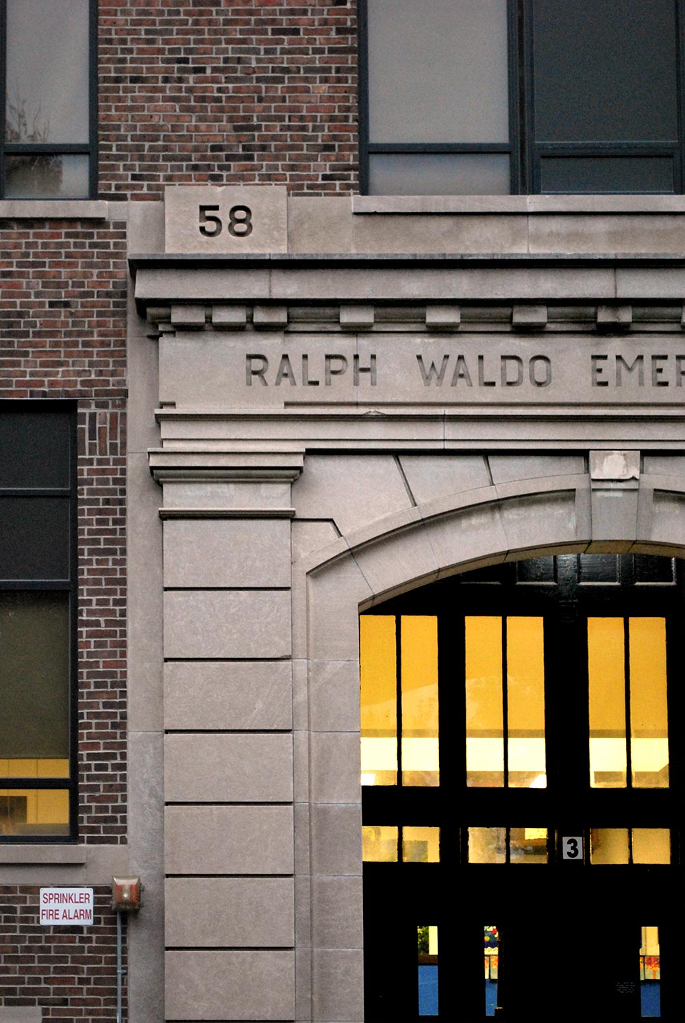
Ralph Waldo Emerson School No. 58 in Indianapolis.
Matt Nowlin / The Polis Center
We used state-reported data from the 2009-2010 and 2015-2016 academic years to interpret these trends in the Indianapolis region. We performed analyses from three perspectives, 1) finding demographic changes at the school level that are indicative of neighborhood changes, 2) viewing regional trends that cut across district lines, and 3) analyzing the spatial characteristics of school change.
Key findings from this report include:
- Regionally, schools are becoming more racially diverse, have a growing share of low-income students, and have increasing graduation rates.
- Low-income student population is falling in central Indianapolis and growing in Marion County’s townships, pointing to a growing number of low-income families living in first-ring suburbs.
- Schools experiencing similar change tend to be grouped geographically, with rapidly changing schools in more urban areas, and those holding steady in racial and income change located in more suburban and rural areas.
Washington Irving School No. 14 in Indianapolis.
Matt Nowlin / The Polis Center
How Schools Are Changing
In our previous report on neighborhood change, we discovered that 2010-2016 was a period of rapid sociodemographic change in the Central Indiana region, and for this report, we set out to discover to what degree similar changes could be seen in schools. We quickly learned that despite an environment of relatively open access to academic assessment data, there was no easy access to regional-level information on school quality, improvement, demographics, and overall change. This report explores school demographic changes and their relationship to demographic changes in our region and in our neighborhoods. Future analyses will look at school performance and quality more broadly.
To provide more school-level information, we are releasing the data used in this analysis through a public, interactive tool. This tool is unique in that it is region-wide and displayed in a map. The regional approach blurs the delineations between school districts and communities, making cross-boundary trends clearer. The mapping approach makes it easier to browse schools spatially instead of by name. Combined, these features make it easier for the public to learn about schools, find trends, and develop a data-informed understanding of schools from a regional perspective.
Through these combined analyses, we conclude that:
- A regional perspective can change the dialogue about school improvement and reveal new insights.
- By considering schools as a regional ecosystem rather than divided into administrative boundaries, trends appear that cross district lines. A regional analysis affords the opportunity to study and visualize patterns in school demographics, performance, and quality.
- School demographic changes are an alternative lens through which to view neighborhood and community change.
Changes in school demographics may reveal changes in neighborhood demographics because many children attend their neighborhood schools. And because schools also help shape and strengthen social ties among young people, understanding whether and how neighborhood characteristics are reflected by local schools provides insight into demographic shifts at a very local level.
We found that the region’s schools are changing demographically, with an average total of 18 percent racial change. Between 2010 and 2016, for the average school in the region, the white share of student population fell by five percentage points, while Latino share grew by four percentage points and Asian share grew by one percentage point. The average school experienced a growth in low-income students, from 44 percent to 48 percent of the student body.
ISTEP (Indiana Statewide Testing for Educational Progress)
ISTEP scores were the basis for most of our performance measures, because this is the data consistently available across all schools and all years in our analysis. However, the ISTEP test has been the subject of policy changes during the study period, and has now been repealed as Indiana’s standardized test. Here we describe some of those policy changes and how we performed this analysis in the context of such assessment changes.
In 2013,4 Indiana became the first state5 to withdraw from the Common Core K-12 education standards for Mathematics and English/Language Arts proficiency. This move prompted the state to develop its own set of academic standards, which were first implemented in the 2015 ISTEP test.
That year, students answered both assessment and pilot questions, which resulted in a much longer and unfamiliar test than many educators and students anticipated. Statewide, ISTEP scores dropped sharply – by ten percentage points or more in many districts – which further prompted concern among administrators and educators whose accountability ratings are tied to test performance. In 2016,6 legislation was passed that would repeal the ISTEP test by 2017. Meanwhile, ISTEP performance has continued to trend lower than the pre-2015 scores. As of October 2018, no new standards have been developed. Lawmakers now say the test will be replaced by 2019.
To analyze change across a time period when the assessment itself was changing, we calculated rank change for each school. Therefore, even if a school’s pass rate declined, if it went up in ranking, we considered that as a performance improvement relative to other schools.
Comparing School Change and Neighborhood Change
Neighborhood Change 1970-2016: Suburbanization, Gentrification, and Suburban Redevelopment analyzed change in five economic and demographic factors: population, race, income, educational attainment, and age. This analysis produced a single score for each census tract in the Indianapolis metro area. The score indicated, from decade to decade, how much these factors had changed and in what direction. This score can also serve as a measure of gentrification, at least since 1980 when gentrification became an emerging trend in Indianapolis.1
Using this analysis as a framework, we can now consider whether schools are changing in ways that align with these neighborhood changes. A school’s demographics could change as the demographics of the surrounding neighborhood change. A school’s quality could change as residents with more political capital move into a neighborhood.2 We might expect to find that schools in areas where income is changing have similar changes in student income, measured by free and reduced lunch status (FRL). Or, given the strong relationship between student income and standardized test performance,3 we may expect a relationship between neighborhoods with rising income and school performance. In neighborhoods where the white population is growing or shrinking, we may expect those changes to be reflected in the demographics of neighborhood schools.
To explore this hypothesis, we used Indiana Dept. of Education (IDOE) reporting data for public and charter schools located within the area of study of our prior analysis, and open both during the 2009-2010 and 2015-2016 school years. We did not include private schools in this analysis, because they are not subject to the same data sharing requirements as public schools, making data availability inconsistent.
Some schools might not appear in our analysis, for example if they have closed since 2010 or opened since 2010. Private schools will not appear in our analysis. Some schools may have change administrative model, from public to charter or innovation school. In these cases, if the state school identification number remains constant, it appears in our analysis. But if the identification number is not consistent across this period, the school will not appear in our analysis. Lastly, if a school has closed at some point since 2010 but reopened before 2016, it could appear in our analysis (as long as its school number is constant).
We compare several measures of school change to our measures of neighborhood change. We compared each school to the census tract where it was located, and did not find strong correlation between our measures of school change and our measures of neighborhood change.
Specifically, we analyzed school change in 13 performance indicators (English/Language Arts ISTEP pass rates for grades 3-8, Math ISTEP pass rates for grades 3-8, and high school graduation rate) and seven demographic indicators (percent of students eligible for free or reduced lunch (FRL), percent of students for each of five racial groups, and total racial change). The strength of the correlations between school performance and neighborhood demographic indicators is almost always zero. In other words, neighborhood change indicators explain none of the variation in school changes. Tables showing the results of least-squares regression analysis are in an appendix available in the online report.
Because many elementary schools, especially in Indianapolis, draw students from the surrounding neighborhoods, this result is surprising. Secondary schools, some elementary schools, and many suburban and rural schools draw students from outside their neighborhood, which could make it less likely that a school’s neighborhood would measurably influence its demographics.
Although no statistical relationship exists between school demographics and our neighborhood change indicators, there are clear spatial patterns in the demographic changes that schools have experienced between 2010 and 2016.
Schools in Urban Core Are Poor, but Growing Less So
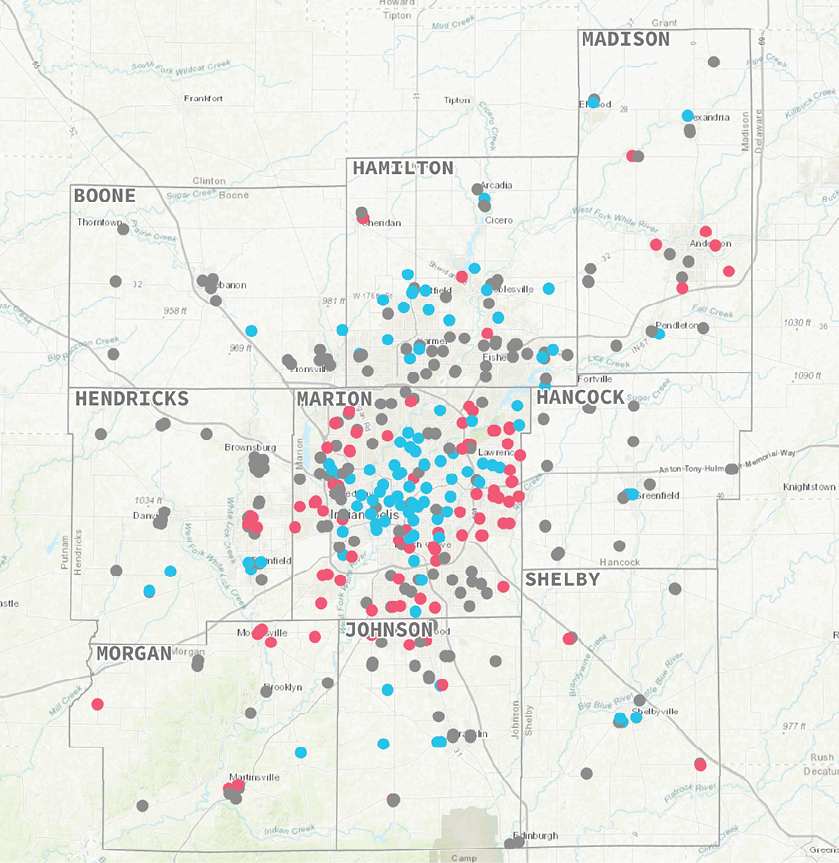
Figure 1. Percent of Students Eligible for Free and Reduced Lunch (2016)
Figure 2. Change in Percent of Students Qualifying for Free/Reduced Lunch
Spatial Patterns in Changing Landscape of Low-Income Students
The share of low-income students in 2016 shows a spatial pattern. The highest proportions are in Indianapolis’ core neighborhoods, while proportions in the suburbs are lower (see Figure 1). Anderson also has a concentration of schools with high shares of low-income students. In order to qualify for free or reduced lunch, a student’s household must earn below 130 percent of the federal poverty level, or $31,980 for a four-person household in 2018.7 For the sake of clarity, we will refer to these as low-income students.
When mapping change in low-income share of students, instead of the rate itself, the opposite spatial pattern exists. Schools in core neighborhoods are experiencing significant declines in the share of low-income students. Schools in the outer townships of Marion County and in Greenwood are experiencing significant increases in low-income students. Anderson schools are also experiencing an increase in low-income students.
Eight in ten Indianapolis Public Schools had a decrease in low-income students as a share of student body. Meanwhile, many township and suburban school districts are experiencing the region’s fastest increase in low income students.
We measured change in terms of percentage point difference, not percent difference. This makes it easier to compare schools with very high and very low rates of low-income students, because percentage point change will not be skewed by starting with a small base.
Table 1. Ten School Corporations with Highest Pct. Low-Income Student Increases
Overall, the average school in the region experienced a 3.9 percent increase in low-income students. Of the 421 schools in our analysis, 273 experienced an increase of at least one percentage point in the share of low-income students. Forty-one schools experienced little change (less than ±1 percent), and 106 schools experienced a decline of one percent or more. Forty-seven of those were Indianapolis Public Schools (IPS). In the average IPS school, the share of low-income students fell 11.3 percent.
Of the ten school corporations with the biggest increases in low-income students (Table 1), seven are Marion County districts other than IPS. The average Marion County charter school became increasingly low-income since 2010, as well as the average school in Greenwood Community Schools.
The total number of low-income students across the eight Marion County township school corporations increased by 12,412 from 2010 to 2016, while the number of low-income students in Indianapolis Public Schools decreased by 5,086 during that same period. The number of low-income students attending any of Marion County’s charter schools increased by 1,795.
These changes may be indicative of a trend called “suburbanization of poverty,” a trend of growing poverty among inner suburbs.8 While the previous neighborhood change study did not establish a significant pattern of low-income households moving to outlying areas, it did identify some specific neighborhoods that might be indicative of such a trend.
For example, in four tracts in Greenwood, Lawrence, Pike Township, and Bridgeport, average family income fell by $9,000-$44,000 as they added 482 households earning less than $30,000 between 2010 and 2016. To be sure, these tracts are not poor. They are middle- to high-income, with average family income ranging from $42,000 to $93,000. But the average family income is falling quickly because of a growing number of low-income households.9
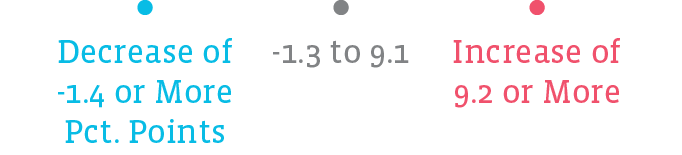
The spatial patterns associated with low-income students support this assumption. Schools with similar changes in low-income students tend to be clustered near each other, and tend to be located in central Indianapolis. This is visible in Figure 2. Schools with significant decreases are clustered in the core of Indianapolis. Schools with significant increases make up a ring around that core. We can also use statistics to describe whether or not these values are clustered or randomly distributed. By using Moran’s Index, a measure of dispersal, we find that these points are clustered, with a 99.9 percent confidence level.
How did we measure clustering and dispersion?
We tested for clustering using Moran’s Index, which measures whether values tend to be clustered (similar values near each other), random, or dispersed (similar values repel each other). One is perfectly clustered, zero is random, and -1 is perfectly dispersed. Moran’s Index for the degree of change in low-income students was 0.3 with a 99.9 percent confidence level. In other words, we are very confident these values are moderately clustered.
How do we measure total racial change?
Measuring the magnitude of racial change can tell us which schools are changing quickly in terms of racial makeup, rather than focusing on change in a particular race. We add together the absolute value of the percentage point change in each race. Absolute value means positive and negative numbers are both converted to positive numbers. If we did not use absolute, an increase in some races would always be canceled out by decreases in others.
Our measure ranges from zero to 200. Zero means there were no changes to racial makeup, 200 means the entire school was one race in 2010 and was entirely a different race in 2016.
Spatial Trends in Other Demographic Changes
In addition to changes in low-income student population, some changes in racial makeup showed clear patterns and significant clustering. For our analysis above, we asked “How much clustering appears is this data?” Now we ask a slightly different question: “Where are clusters located?” Hot spot analysis can reveal statistically significant clusters where a particular race is increasing or decreasing in nearby schools.
A cluster of schools with increasing white populations is found in the center of Marion County, along the Meridian Street corridor. This relates closely to the findings in our neighborhood change analysis which indicated that neighborhoods along that same corridor were becoming significantly more white. Clusters of schools becoming less white are located on the eastern, western, and southern edges of Marion County.
These align with “hot spots” for other racial groups, where clusters of schools are seeing an increase in another race. On the east side, there are concentrations of schools with increasing black and Latino student populations. On the west side, there are concentrations of schools with increasing Latino student populations. On the south side, there is a significant cluster of schools with increasing Asian populations. In the center of Indianapolis, there is a cluster of schools with decreasing black student population. This corresponds to the location of the cluster of increasing white student population. In Anderson, there is a concentration of schools with decreasing numbers of black students and increasing numbers of Latino students and students of other races or multiple races.
There are clusters of schools with a high magnitude of racial change in central Indianapolis, the far east side, and the far south side.
Overall, the most significant change in schools’ racial makeup is occurring in Marion County. By measuring the magnitude of change, we can map where change is most significant and find where clusters of racial change occur. The typical school had a total racial change measure of between 10 and 26. The highest total racial change for any school was 127, and the lowest was 0.7.
Most of the schools with total racial change over 26 are located in Indianapolis. Outside of Indianapolis, most schools have experienced relatively little racial change. Among Marion County school corporations (including charter schools), the average racial change is 26.3. Outside of Marion County, the average is 10.0.
There are clusters of schools with a high magnitude of racial change. These are located in the far east side, far south side, and central neighborhoods of Indianapolis. These correspond with the clusters of change in individual races described above.
Spatial Clusters of Demographic Changes
The racial makeup of schools in the region is changing quickly. Black and Latino enrollment is increasing in Indianapolis’ inner suburbs, as white enrollment is increasing in central and north-central Indianapolis. Asian enrollment is increasing in southern Indianapolis and Greenwood. Schools in Indianapolis, Anderson, Shelbyville, Carmel, and Westfield have experienced the most significant change in racial makeup.
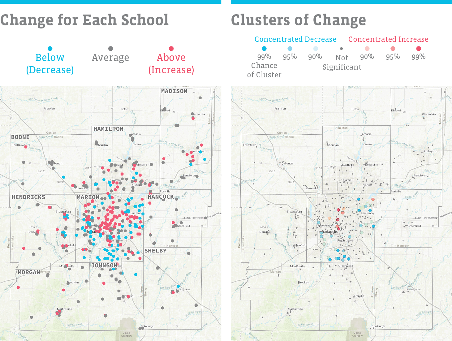
Figure 3. Change in White Students as Percent of Student Body
The share of white students is growing in central Marion County and many schools in outlying counties. There is a statistically significant cluster of schools with increasing white enrollment downtown and north along Meridian Street. There are clusters of schools with decreasing white enrollment in eastern, western, and southern Marion County.
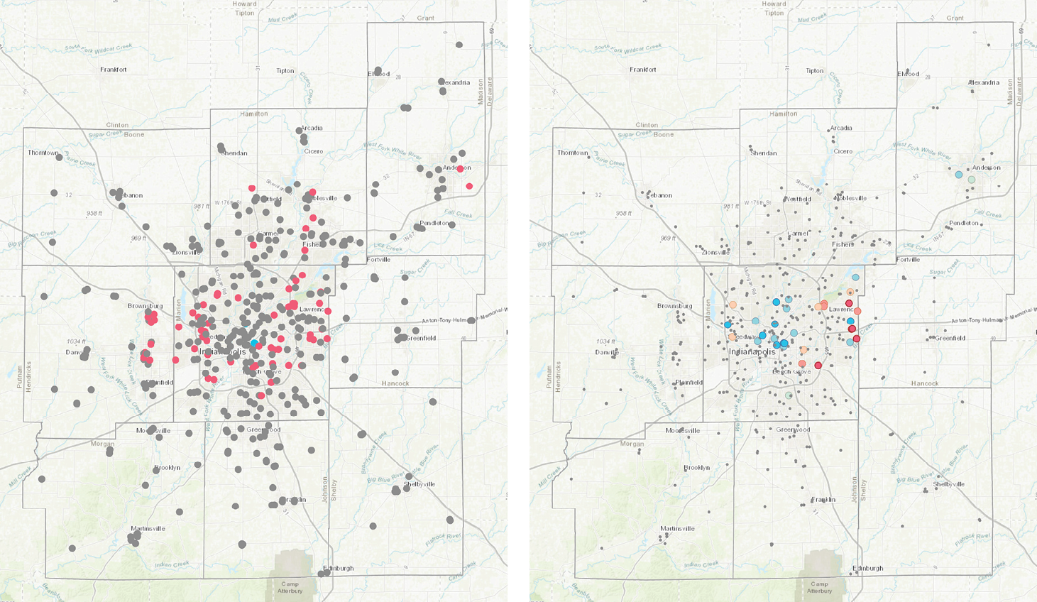
Figure 4. Change in Black Students as Percent of Student Body
There are clusters of increasing black enrollment on the far east side and southeast side of Indianapolis. Black enrollment is also increasing at many schools in other parts of Marion County, Hendricks County, Hamilton County, and Anderson. There are clusters of schools with decreasing black enrollment in central Indianapolis, as well as Broad Ripple, the far east side, Eagle Creek, and Anderson.
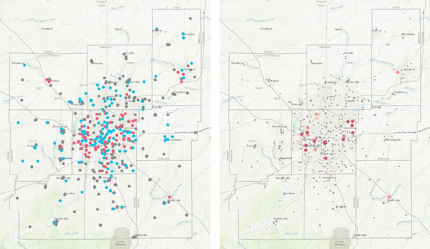
Figure 5. Change in Latino Students as Percent of Student Body
Latino enrollment is growing fastest in the inner suburbs of Indianapolis and in outlying cities like Avon, Lebanon, Shelbyville, and Anderson. Latino enrollment is stable or declining in central Indianapolis and most other areas. There are statistically significant clusters of increasing Latino enrollment in downtown Indianapolis, on the west side, near Lawrence, and near Beech Grove.
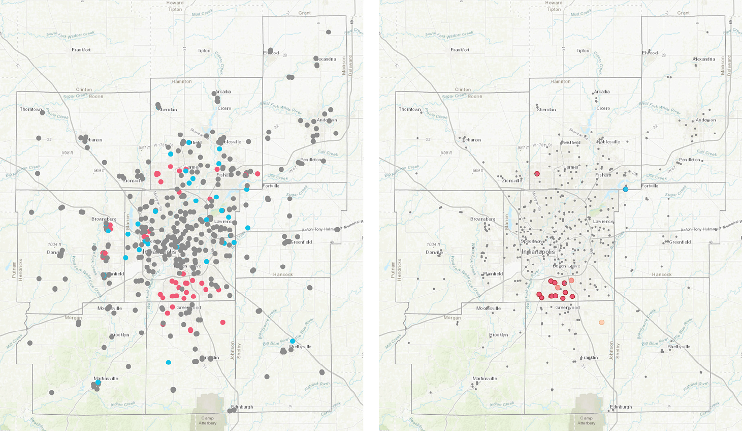
Figure 6. Change in Asian Students as Percent of Student Body
Asian enrollment is increasing fastest in southern Marion County and northern Johnson County, as well as parts of Hamilton County and Hendricks County. The significant clusters of increasing Asian enrollment are in southern Marion County and western Carmel. The only significant cluster of decreasing Asian enrollment is near Fishers and Fortville.
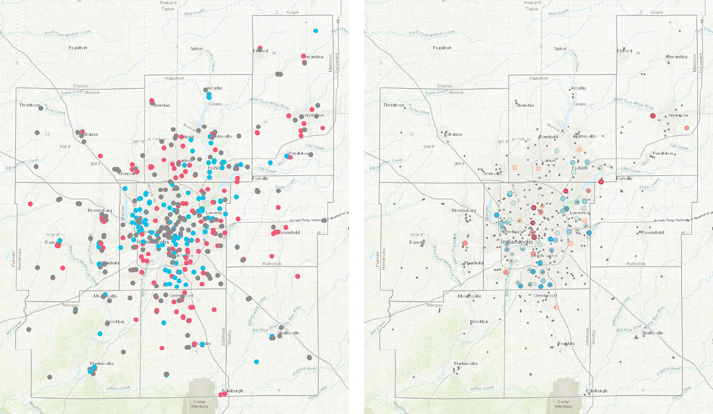
Figure 7. Change in Students of Other Races or Multiple Races as Percent of Student Body
Enrollment among students of other races or multiple races is increasing quickly across most urbanized parts of the region, though it is decreasing in central Indianapolis and Pike, Lawrence, and Perry townships. There are clusters of increasing enrollment near Geist, Castleton, and Anderson.
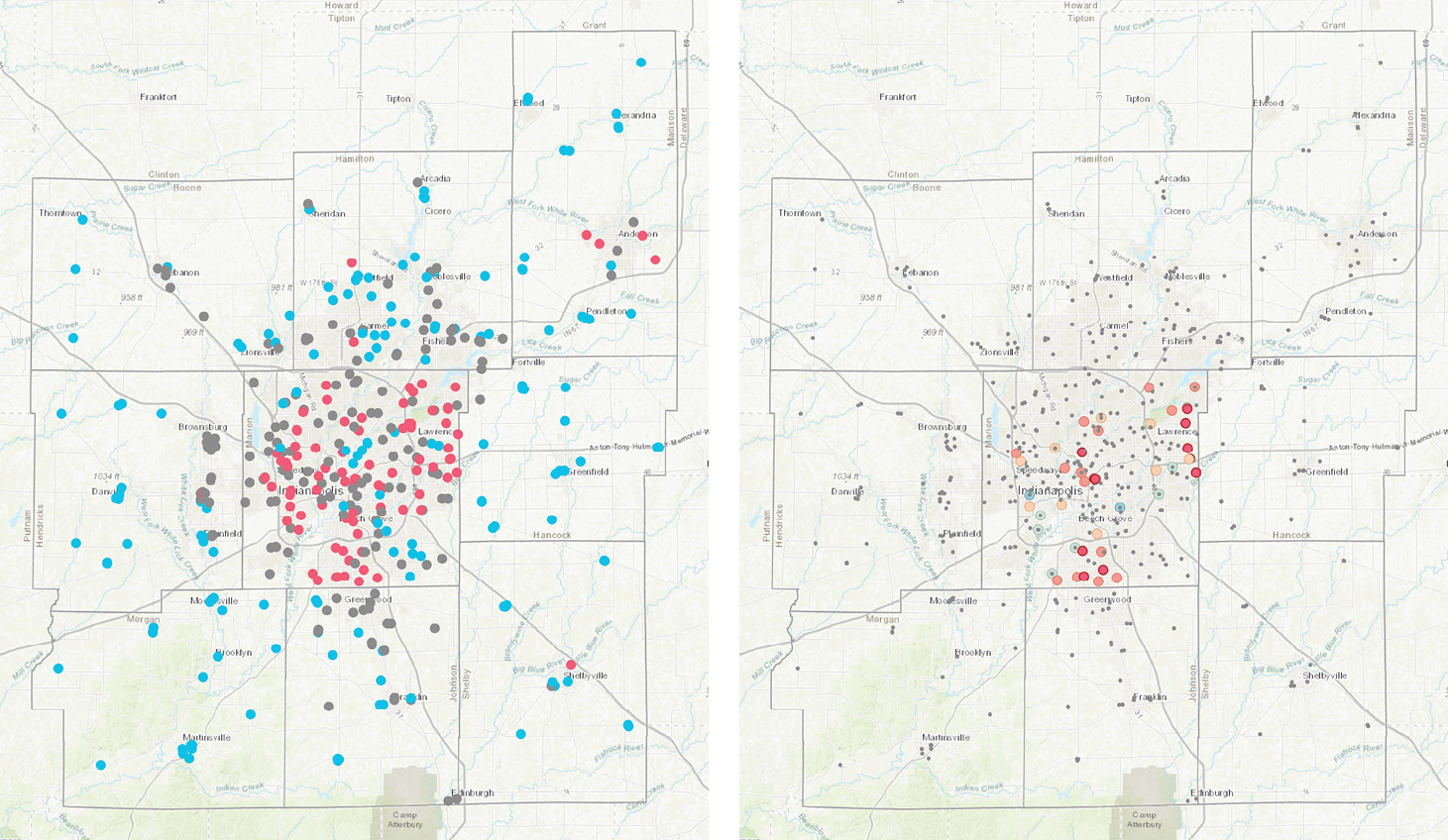
Figure 8. Magnitude of Racial Change
Overall, the racial makeup of schools is changing fastest in Indianapolis, Shelbyville, Anderson, Carmel, and Westfield. There are clusters of significant racial change in several Marion County townships, including Center, Lawrence, Warren, and Perry.
How did we measure racial congruence between teachers and students?
For each racial group, we found the difference between the proportion of students in that group and the proportion of teachers in that group. We took the absolute value of this difference and added it together for all races. Then we divided by two and subtracted from 100. The results is a scale from 0-100 percent, where 0 means there is complete incongruence — none of the teachers are of the same race as the students, and 100 means there is complete congruence in the racial makeup of students and teachers.
Region’s Students More Diverse than Teachers
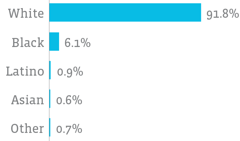
Percent of Teachers by Race
(Average School, 2016)
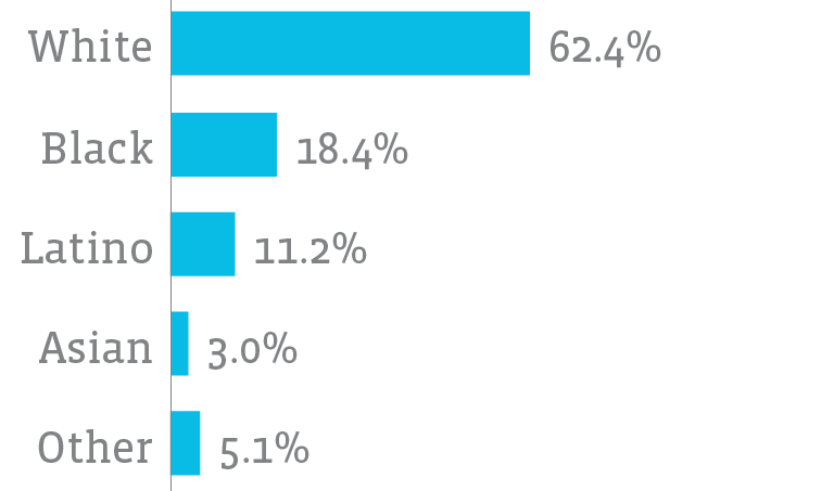
Percent of Students by Race
(Average School, 2016)
Teacher Demographics
When students of color are taught by a teacher of color, it may have implications for their education. Research has found that having a teacher of color could impact expectations for students,10 perception of students,11 and student achievement.12
The majority of the teachers in the region are white (91.7 percent) as of 2016. The second most common race among teachers is black (6.1 percent) followed by Hispanic (0.9 percent) and multiracial (0.7 percent). The Metropolitan School District (MSD) of Pike Township is the most diverse school district. In the average Pike Township school, 28 percent of its teachers are people of color. For the average school in IPS, MSD Lawrence, and Marion County charter schools, eight in ten teachers are white.
There were ten school corporations that had no teachers of color in 2016. These were rural and exurban districts in Boone, Shelby, Hamilton, Morgan, and Madison counties. A third of the region’s black teacher population taught at Indianapolis Public Schools, where they composed 15 percent of the teaching body. However, there were two school systems where black teachers were a larger share of the teacher population, the MSD Pike Township (24.3 percent) and Marion Charter Schools (15.8 percent). More than 20 percent of the region’s Hispanic teacher population taught in the Metropolitan School District of Lawrence Township, where they composed 4 percent of the teachers.
This racial breakdown does not reflect the makeup of students in our region. This is particularly the case in more diverse part of the Indianapolis metro area. We calculated racial congruence between teachers and students at each school on a scale from 0-100 percent, where 100 means the racial makeup of teachers perfectly matches the racial makeup of students.
The lowest ten schools in terms of racial congruence between teachers and students all scored between 10 and 20 percent. Eight of these ten are IPS schools. In six of these schools, the majority of students are black, and in one the majority are Hispanic. However, in these eight IPS schools, 88.4 percent of teachers are white. We found teacher race data for 44 out of the 53 IPS schools in our analysis. The average IPS school has a 40.6 percent racial congruence between students and teachers.
Wonder how your neighborhood school has changed?
Use our interactive data tool to find out.
What is k-means clustering?
K-means clustering takes data points that are not grouped or categorized and finds groups where:
- Points within groups are as similar as possible, while
- Groups are as different from each other as possible.
It is an “iterative algorithm,” meaning it repeats itself over and over again until the optimal groups are discovered.
Schools Experiencing Similar Change
We identified meaningful groups of schools based on how they have changed in terms of low-income students and the racial makeup of the student body. We used k-means clustering to perform this analysis.
To measure change in low-income students, we found the difference in the percent of low-income students in 2016 and 2010. To measure the change in race, we used the total racial change measure, described above (the absolute value of percentage point change in each racial group).
The analysis identified five groups. While verifying the results of the analysis, we combined two similar groups. Four meaningful categories of schools remained:
- Schools with high low-income change and low race change (high-low; Group A)
- Schools with low low-income change and high race change (low-high; Group B)
- Schools with high low-income change and high race change (high-high; Groups C). Here, two groups were combined because they shared similar characteristics
- Schools with low low-income change and low race change (low-low; Group D)
Although clustering sorted the data by two key attributes of change, when we mapped the results of the clustering, we found that the groups also shared some spatial qualities.
Clusters of Schools with Similar Demographic Change
Low-Income and Race Change for Median School in Each Group
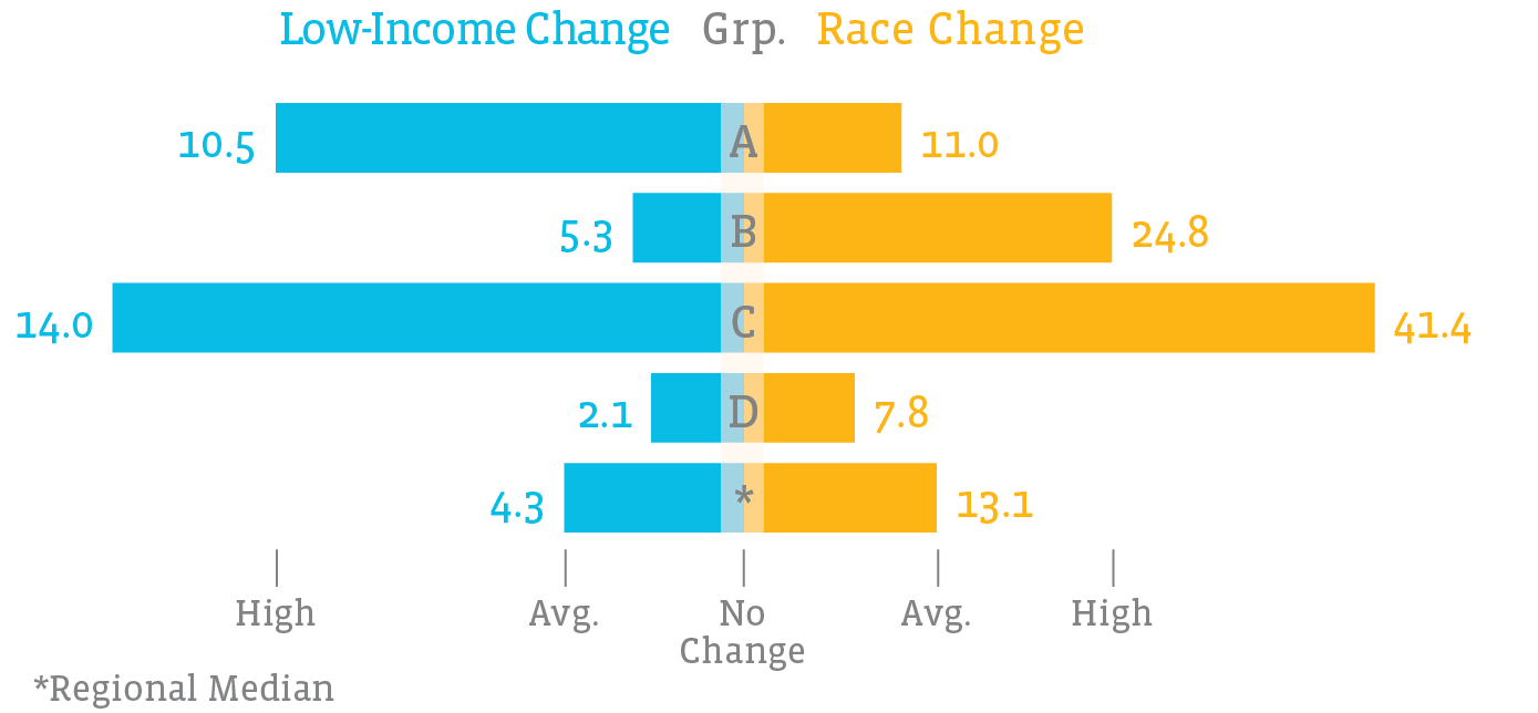
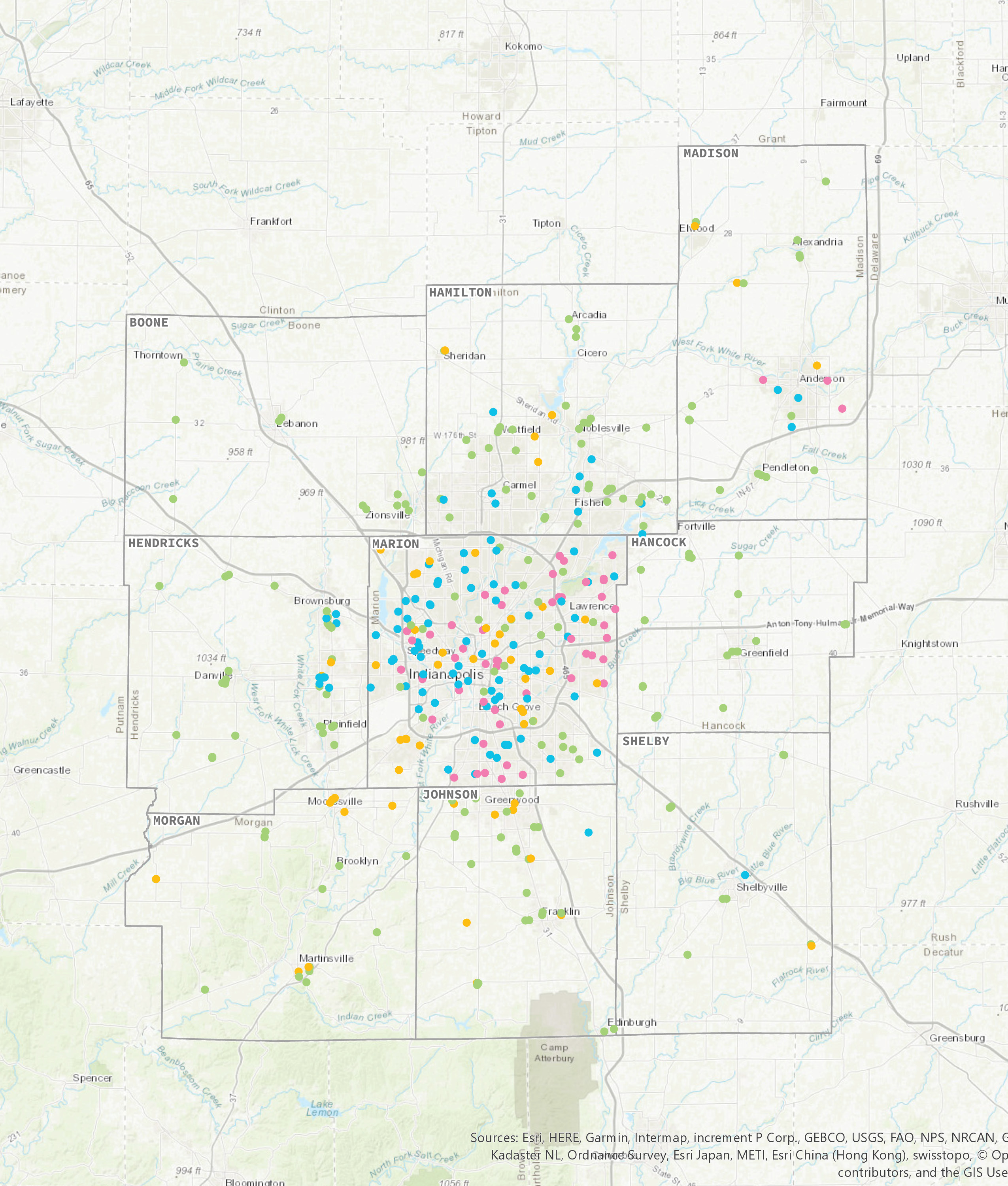
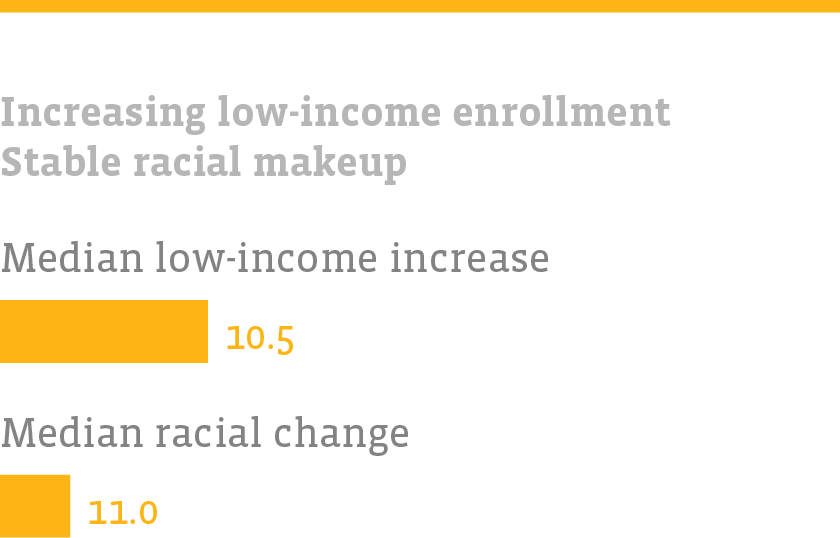
GROUP A
These schools have a growing share of low-income students, but their racial makeup is not changing significantly. Schools with higher than average FRL change, but lower than average race change (Group A, n=59) were primarily located in the suburbs of Indianapolis and neighboring cities. These schools have an average of 7 percent more students qualifying for free and reduced lunch (the global average change is about 4 percent), but have had slightly less change in racial composition (approximately 10 percent compared to 18% regionally).
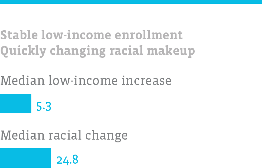
GROUP B
These schools do not see much change in FRL rate, but their racial composition is changing quickly. Schools with lower than average FRL change, higher than average race change (Group B, n=101) clustered mostly within Marion County, and the surrounding cities in Hamilton and Hendricks Counties, as well as Anderson and Shelbyville. On average, only 3 percent more students in these schools qualify for FRL, but racial composition has changed 26 percent in these schools, compared to 18 percent regionally.
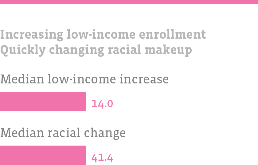
GROUP C
These schools have a growing proportion of low-income students, and their racial makeup is changing quickly. Schools with higher than average FRL change and higher than average race change (Group C, total n=59) are located almost exclusively within Marion County, except for a few located in and around Anderson. These schools have an average FRL change of 9 percent compared to 4 percent globally, and an average race change of 46 percent compared to 18 percent regionally.
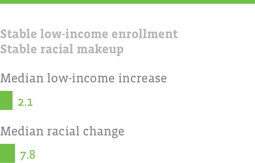
GROUP D
These schools are not changing quickly in terms of race or income. Group D (low-low) schools are scattered throughout the metro area, but are less common in Marion County (n=202). This is the largest grouping by far. On average, these schools have seen the least change. They have had an FRL change of 2 percent compared to 4 percent globally, and student racial composition change of 9 percent compared to 18 percent regionally.
Discussion
School Demographics Indicate Suburbanization of Poverty
While there was no correlation found between school change and neighborhood change, school-level demographic changes show that higher-income families may be moving to central Indianapolis while lower-income families may be moving to the outskirts of Marion County.
The share of low-income students is falling in the core of Indianapolis and rising in Marion County’s outer townships as well as Danville, Greenwood, and Mooresville. This aligns with demographic patterns suggested in our neighborhood change research, where many Center Township census tracts were attracting higher-income families.
This is important information for administrators and policy-makers to consider, because it impacts the need for future resources. This information is also helpful for planners and community organizations, because it suggests that low-income households may be on the rise in older, first-ring suburbs.
Region’s Schools Growing More Diverse, More Low-Income
In summary, we found that the region’s schools are changing demographically, with an average total of 18 percent racial change. Between 2010 and 2016, for the average school in the region, the white share of student population fell by five percentage points, while Latino share grew by four percentage points and Asian share grew by one percentage point. The average school experienced a growth in low-income students, from 44 percent to 48 percent of the student body.
The growing diversity of our regional student body may indicate a need to address a lack of racial congruence between students and teachers. As described above, some literature shows a positive benefit to student achievement and teacher perceptions if a student has a teacher of their own race. If this is a regional policy priority, steps must be taken to develop a more diverse teacher workforce and attract and retain that workforce in Central Indiana.
Implications of Assessing School Change
In general, by sharing data more easily and openly about performance, quality, and demographics, community members will have a more nuanced understanding of education outcomes. Nuance is important in understanding school assessment and evaluation. The intersection of statistics and politics makes school evaluation a volatile field, but one with critical outcomes, such as school selection and state takeover of schools. Therefore, it is vital for the regional community to have easy access to information in a way that conveys the complexity of education evaluation.
Our research explores demographic trends in schools, but further research is needed to understand performance trends, and to understand student-level data.
Performance data should be explored to discover if any relationships exist between demographic change and performance change at the school level. As low-income students increasingly move into schools in inner suburbs, how does this impact these students’ performance? Or their new schools performance? And as higher income households move into urban schools, what effect does this have on student and school performance metrics?
Student-level data is needed to more accurately understand neighborhood dynamics. While schools often approximate nearby demographics, schools in less populated areas, magnet schools, and other alternative school models can draw students from a wide area. Data sharing between the state and researchers would facilitate understanding of student demographics and performance in neighborhoods across the region.
Find more interactive content from our series on neighborhood change.
No Results Found
The page you requested could not be found. Try refining your search, or use the navigation above to locate the post.
End Notes
- Nowlin, Matt, Kelly Davila, and Unai Miguel Andres. Neighborhood Change 1970-2016: Suburbanization, Gentrification, and Suburban Redevelopment. Report. The Polis Center, IUPUI. 2018. 14.Nowlin, Matt, Kelly Davila, and Unai Miguel Andres. Neighborhood Change 1970-2016: Suburbanization, Gentrification, and Suburban Redevelopment. Report. The Polis Center, IUPUI. 2018. 14.▲
- Butler, Tim, Chris Hamnett, and Mark J. Ramsden. “Gentrification, Education and Exclusionary Displacement in East London.” International Journal of Urban and Regional Research 37, no. 2 (2013): 556-75. doi:10.1111/1468-2427.12001.▲
- Sirin, Selcuk R. “Socioeconomic Status and Academic Achievement: A Meta-Analytic Review of Research.” Review of Educational Research 75, no. 3 (2005): 417-53. doi:10.3102/00346543075003417.
For an approachable discussion of the issue, see Willingham, D. “Why Does Family Wealth Affect Learning?” American Educator. (2012): 33-39. https://www.aft.org/sites/default/files/periodicals/Willingham.pdf▲ - H.R. 1427, Sess. of 2013 (Ind. 2013).▲
- Wilson, Reid. “Indiana First State to Pull out of Common Core.” The Washington Post, March 25, 2014. Accessed October 25, 2018. https://www.washingtonpost.com/blogs/govbeat/wp/2014/03/25/indiana-first-state-to-pull-out-of-common-core/.▲
- H.R. 1395, Sess. of 2016 (Ind. 2016).▲
- State of Indiana. Department of Education. “Indiana Department of Education Announces Income Eligibility Guidelines for Free and Reduced-Price School Meals and Milk Programs.” News release, January 11, 2018. Accessed October 17, 2018. https://www.doe.in.gov/news/indiana-department-education-announces-income-eligibility-guidelines-free-and-reduced-price.▲
- Kneebone, Elizabeth. The Suburbanization of Poverty. Brookings Institution. January 20, 2010. Accessed October 25, 2018. https://www.brookings.edu/research/the-suburbanization-of-poverty-trends-in-metropolitan-america-2000-to-2008/.▲
- U.S. Census Bureau. 2016 American Community Survey 5-Year Averages. Generated from American FactFinder. https://factfinder2.census.gov▲
- Beady, Charles H., and Stephen Hansell. “Teacher Race and Expectations for Student Achievement.” American Educational Research Journal 18, no. 2 (March 1981): 191–206. doi:10.3102/00028312018002191.▲
- Pigott, Rowan L., and Emory L. Cowen. “Teacher Race, Child Race, Racial Congruence, and Teacher Ratings of Childrens School Adjustment.” Journal of School Psychology 38, no. 2 (2000): 177-95. doi:10.1016/s0022-4405(99)00041-2.▲
- Dee, Thomas S. “Teachers, Race, and Student Achievement in a Randomized Experiment.(Author Abstract).” Review of Economics and Statistics, no. 1 (2004). https://www.ulib.iupui.edu/cgi-bin/proxy.pl?url=https://search.ebscohost.com/login.aspx?direct=true&db=conedsqd5&AN=edsbig.A114924428&site=eds-live.▲
Other References
Blau, David M. “The Effect of Income on Child Development.” Review of Economics and Statistics 81, no. 2 (1999): 261-76. doi:10.1162/003465399558067.
Chetty, Raj, John Friedman, Nathaniel Hilger, Emmanuel Saez, Diane Whitmore Schanzenbach, and Danny Yagan. “How Does Your Kindergarten Classroom Affect Your Earnings? Evidence From Project STAR.” 2010. doi:10.3386/w16381.
Desimone, Laura. “Linking Parent Involvement With Student Achievement: Do Race and Income Matter?” The Journal of Educational Research 93, no. 1 (1999): 11-30. doi:10.1080/00220679909597625.
Duncan, Greg J., and Katherine A. Magnuson. “Can Family Socioeconomic Resources Account for Racial and Ethnic Test Score Gaps?” The Future of Children 15, no. 1 (2005): 35-54. doi:10.1353/foc.2005.0004.
Fryer, Roland, and Steven Levitt. “Understanding the Black-White Test Score Gap in the First Two Years of School.” 2002. doi:10.3386/w8975.
Gorard, Stephen, and Beng Huat See. “The Impact of Socioeconomic Status on Participation and Attainment in Science.” Studies in Science Education 45, no. 1 (2009): 93-129. doi:10.1080/03057260802681821.
Katz, Benjamin, and Priti Shah. “The Role of Child Socioeconomic Status in Cognitive Training Outcomes.” Journal of Applied Developmental Psychology 53 (2017): 139-50. doi:10.1016/j.appdev.2017.10.003.
Reardon, Sean F., and Joseph P. Robinson. “Patterns and Trends in Racial/Ethnic and Socioeconomic Academic Achievement Gaps.” Handbook of Research in Education Finance and Policy. doi:10.4324/9780203961063.ch28.