This is part of our IndyVitals blog series, exploring the data behind IndyVitals.org.
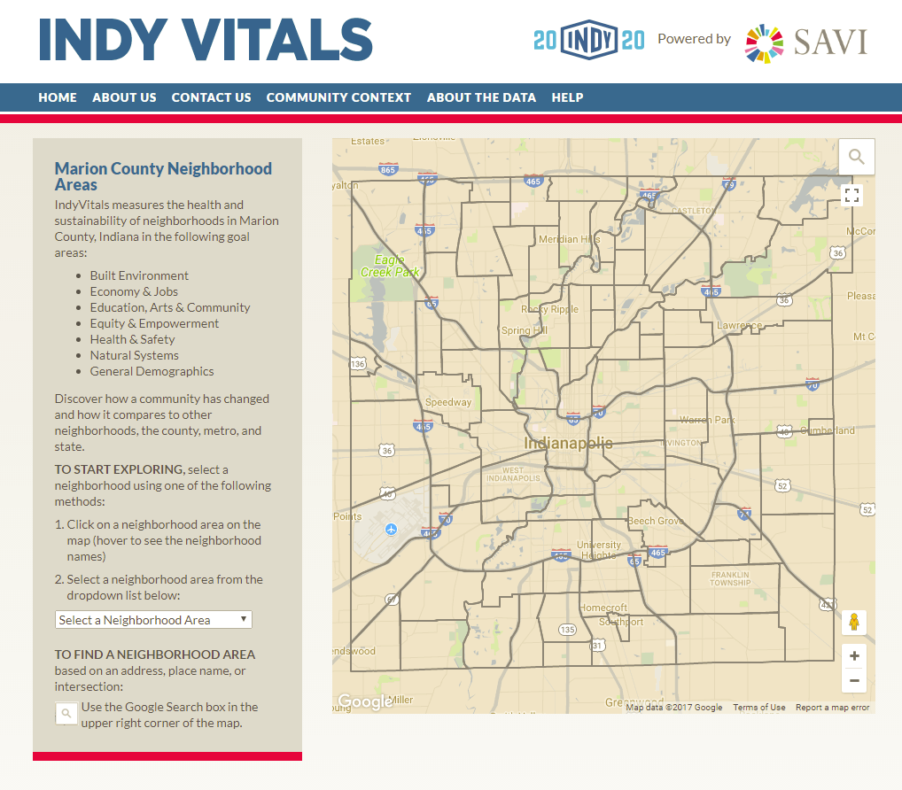
Have you ever wondered exactly what type of businesses are offered in your neighborhood or an area in which you’d like to live and be close to your job? Interested in food services, hospitality, finance/insurance, healthcare, or retail? This information is readily available with the digital tool IndyVitals. Using the interactive map below, select an Indianapolis neighborhood to see what job sectors show up.
The shaded map represents the percentage of residents employed in their own neighborhood. You may determine the total number of jobs per neighborhood (the bubble and pie charts illustrate the actual number and the percentage of total jobs that each economic sector represents respectively for the chosen neighborhood area and all of Marion County) and you can compare the per capita income of the chosen neighborhood to that of all of Marion County. Did you enjoy this dashboard? Check out indyvitals.org to learn more about your neighborhood!


