In October, we wrote about the most mixed-income neighborhoods in Indianapolis. We measured income diversity as the probability that, if you select two individuals from a neighborhood, they will be from different income groups. We then normalized this to a 0-100 scale, where zero is the lowest possible income diversity and 100 means residents are divided equally among all income categories. The typical tract in the region scored 61.
Income diversity is important because, generally, researchers agree that mixed-income neighborhoods can have advantages for low-income residents in the form of place-based improvements, like better schools, safer neighborhoods, well-maintained infrastructure. (Research generally does not show evidence for positive effects from low-income residents interacting with people from other socioeconomic classes. See the previous article for an overview of the literature.)
Some of the most income diverse neighborhoods were the Old Northside and Herron Morton, Rocky Ripple and Crows Nest, and the area near Pike High School.
Now we are focused on the least income diverse neighborhoods, where income is highly concentrated around a few categories. A tract could have low income diversity because most households are concentrated in low-income groups, middle-income groups, or high-income groups.
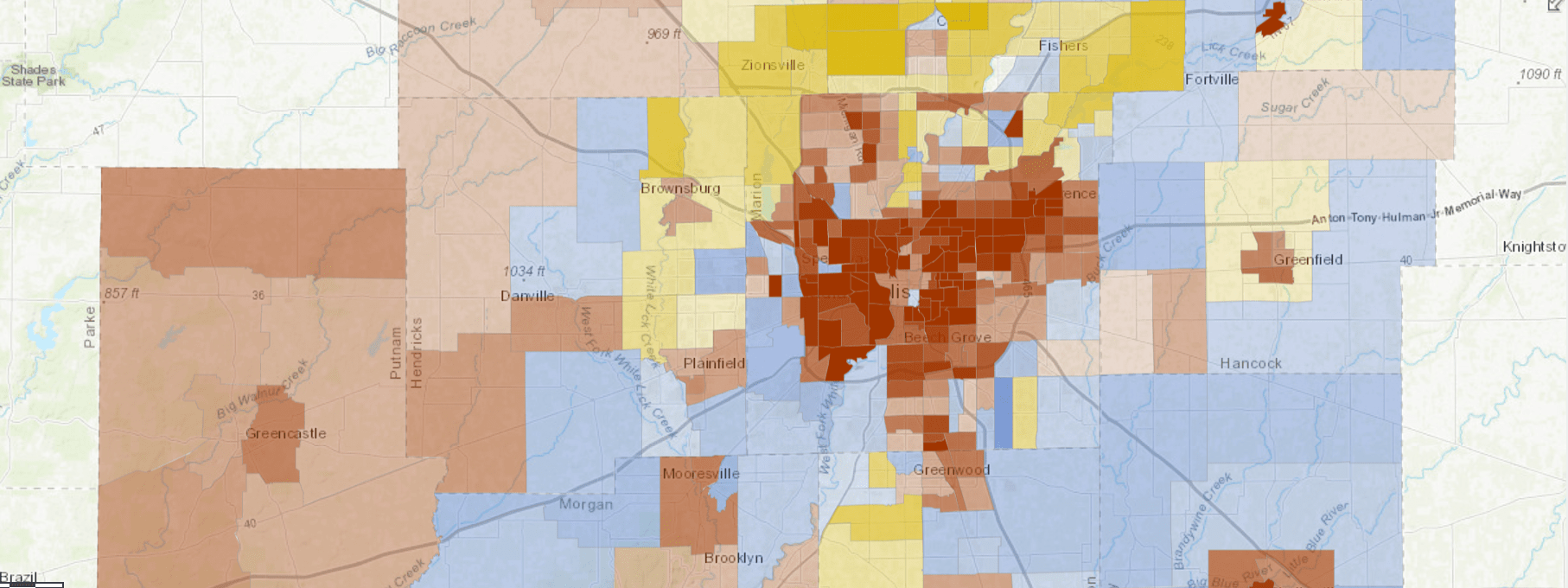
The map below shows the predominant income group located in each tract. We based the cutoffs for these income groups on the region’s typical household income (called the area median income, or AMI), which was $66,700 in 2016. We considered incomes from $50K-$99.9K to be near the median. Households earning less than $50K are below, and households earning $100K are above.
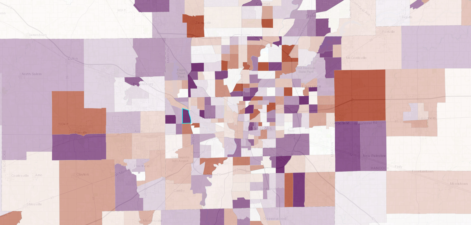
If you layer the two maps we’ve seen so far, you see tracts with relatively low diversity of income groups, shaded based on which income groups are concentrated there. In the map below, tracts are filtered so only the bottom third in terms of income diversity are shown (scoring 58 or below).
Generally, the results show that tracts with incomes concentrated above the median are located in the northern suburbs, tracts with incomes concentrated near the median are located in southern suburbs, and tracts with incomes concentrated below the median are located on the southwest side of Indianapolis and the east side, between 16th and 30th Streets.
Below, we will walk through an example of each of the areas: concentrated high income, middle income, and low income.
Three Examples of Low Income Diversity
Concentrated in Middle-Income Categories
Eastern Franklin Township (Tract 3904.02)
This part of Marion County’s Franklin Township has become less income diverse since 2011. In 2016, it was one of the least income diverse areas in the region, with a score of 38.75.
Most households are concentrated in the middle income categories, and this concentration is increasing. In 2016, 56 percent of households earned $50K-$99.9K, up from 50 percent in 2011. The share of the population below that income level fell by 9 percentage points, and above that fell by 3 percentage points.
Concentrated in Low-Income Categories
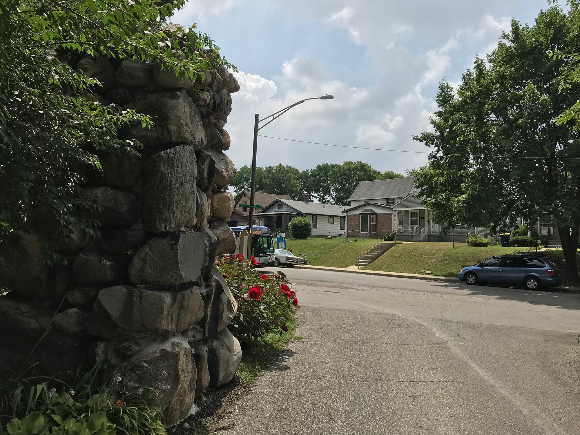
Martindale Brightwood (Tract 3508)
More than a third of households here earn less than $10K per year, and 95 percent earn less than $50K per year. This concentration in low-income categories makes this one of the least income diverse areas in the region. It scores 39.16, and that has fallen by over 6 points since 2011.
The decrease in diversity is due mostly to redistribution within the low-income categories, rather than redistribution between low, middle, and high categories. In 2011, there were to “peaks” in the income distribution chart, with large concentrations at $0-$9.9K and $15K-$24.9K. By 2016, there was only peak, concentrated at $0-$9.9K.
Concentrated in High-Income Categories
Tract 1109.07 in Carmel
This Carmel tract scores only 36.64 in terms of income diversity, because four in ten households are in the $200K or more category. Three quarters of the tract earns $100K or more, while only 8 percent earns less than $50K. While the income diversity score has not changed much since 2011, the location of the income concentration has shifted from $100K-$149.9K to $200K and above.
In 2011, 36 percent of households earned $100K-$149.9K. By 2016, that had fallen to 21 percent, while households earning $200K or more grew from 22 percent to 39 percent.
Further Questions
In future weeks, we will look at tracts that have changed the most in terms of income diversity. The spatial pattern with this data is not clustered, meaning tracts with increasing or decreasing income diversity are not necessarily clustered together. Instead they are scattered throughout the region. The average tract got moderately more income diverse (an increased score of 1.7).
Income diversity can change for a few different reasons. It could be an increase in high, middle, or low income groups. It could be the addition of income groups that were not present before. It could represent the transition from one income concentration to another. We will explore all these possibilities and sort out which patterns exist in which parts of the region.
See How Your Neighborhood Has Changed
Find more interactive content from our series on neighborhood change.
No Results Found
The page you requested could not be found. Try refining your search, or use the navigation above to locate the post.
Next Up
 Indy Neighborhoods with Fastest Changing Income Diversity
Most neighborhoods became more mixed-income between 2011 and 2016. Farley, near Ben Davis, had the biggest increase in income diversity, while the historically black suburb Grandview had the biggest decrease.
 Indy’s Most Mixed-Income Neighborhoods
We measured income diversity in every neighborhood in the region, and the most mixed-income neighborhoods include the Old Northside, the tract containing Rocky Ripple and Crows Nest, and the area near Pike High School.
 After Public Investment, St. Clair Place’s Housing Market Significantly Stronger
Mortgage activity in St. Clair Place shows a dramatic increase in home purchases and home value since 2007. The area is more diverse than ever and poverty is falling for people of color. But home buyers are still 76 percent white.
 Income Inequality High Where Golden Hill and Northwest Indianapolis Converge
In the area where wealthy Golden Hills converges with the working-class neighborhoods of Northwest Indianapolis, income inequality is high and increasing. The area is also experiencing a growth of white households above the median income.