Although the Civil Rights Movement began to reshape race relations, especially by making segregation illegal, the policies and practices of a segregated society continue to influence American society. Residential housing is one area in which the impacts of housing discrimination are destructive and long-lasting. What is not so apparent to many citizens is the relationship between these discriminatory policies and current economic, health, and environmental outcomes.
This article describes the long-term impact of segregation and redlining on economic opportunity, health outcomes, and the environment
Why measure segregation instead of race?
This analysis continues our research into economic mobility and opportunity based on the work of Harvard economist Raj Chetty, who found that children born into low income families in segregated cities tend to have lower earnings in adulthood. As of 2000, Indianapolis ranked 14th among the nation’s 50 largest cities on Chetty’s segregation scale.
By measuring segregation at the neighborhood level, we can understand its influence on economic opportunity within Indianapolis. By measuring the effect of redlining, or housing policies of banks and government designed to promote segregation, we aim to show how it resulted in systemic racial inequities in our communities.
Public policy research, including our own work, often uses race to compare outcomes. For example, we might compare standardized test scores or household incomes by race. When we do this, we are using race, a social construct, as a substitute for measuring racial inequities, which are the effect of historical segregation rather than any innate difference between races.
To avoid creating a statistical model that represents race itself as the cause of inequities, we instead directly measure discriminatory actions using segregationist policies (redlining) and their results (racial segregation in neighborhoods of the 1990s). We measure segregation in the 1990s rather than now because we want to examine long-term impacts of segregation as the cause of quality of life outcomes. Therefore, it is important to measure segregation at a time before the effects we measure. This allows us to predict contemporary economic opportunity, health outcomes, and environmental conditions resulting from racial inequities having partial origins in segregationist policies.
What are the origins of segregation?
During the early 20th century, African Americans fled the Jim Crow South in a series of mass migrations that by 1960 resulted in a dramatic demographic shift, from 90% of Blacks Americans living in the rural Southeast, to 90% living in urban areas across the country.
After arriving in cities during the Great Migration, Black Americans settled in segregated areas, often not by choice. Governmental policies and private practices—zoning laws, restrictive housing covenants, racial steering by real estate companies, and discriminatory lending policies—forced them into specific areas. Violence often resulted from efforts to breach the wall of segregation. The areas relegated for people of color were typically lower quality, with unsafe and unsanitary housing conditions, high density, inadequate public infrastructure, poor schools, and little, if any, public transportation.
In many cases, later migrants lived with friends and family who had fled the South in earlier generations, further increasing economic strain in existing households. Racially unequal economic support systems also limited availability of welfare, federal college aid, and subsidized housing loans in the New Deal and the GI Bill to people of color. Still, Black residents developed thriving neighborhoods like Indiana Avenue and Martindale that contributed enduring cultural, religious, and economic legacies.
Despite the legal and cultural successes of the Civil Rights Movement of the 1950s and 1960s, many states and localities sought to protect existing segregation patterns. Racial steering and discriminatory lending policies, while federally outlawed, were still practiced. ‘White flight’ marked many cities as new suburbs became whites-only enclaves. City services increasingly shifted to the suburbs as urban cores became primarily populated by persons of color. Cities struggled to collect sufficient property taxes to provide adequate resources for various public services, such as education, libraries, policing, fire, and health. This was caused by lower land values relative to suburbs, tax increment financing that removed many properties from the tax rolls, and, in Indiana, state-imposed limits on tax rates. Individuals and families within these communities became increasingly isolated from city resources.
How did redlining work?
The Home Owner Loan Corporation (HOLC) was established in 1933 for the purpose of stabilizing the mortgage lending system in the nation. By purchasing mortgages for families that were on default and providing them with better refinancing deals, HOLC allowed for smaller payments over a longer period of time. Between 1936 and 1939, the HOLC embarked on the City Survey Program, which led to the drawing of “residential security maps” for 239 cities nationwide. The aim was to assess the conditions loan officers should use in making loans.
While HOLC might not have used the security maps for the allocation of refinance mortgages, its overseeing agency, Federal Home Loan Bank Board (FHLBB), encouraged lenders to consider neighborhood conditions before making loans (Hillier, 2005). Through its monthly publication, the Federal Home Loan Bank Review, the FHLBB ran a series titled “Neighborhood Standards as They Affect Investment Risk” in which it highlighted the need to consider neighborhood conditions when approving loan. The series outlined the process needed to create security maps that followed the same criteria, classification, and coloring as those created by HOLC.
The residential security maps developed by the HOLC classified neighborhoods in 4 categories:
- A – “Best” areas, colored green
- B – “Desirable” areas, colored blue
- C – “Declining” areas, colored yellow
- D – “Hazardous” areas, colored red.
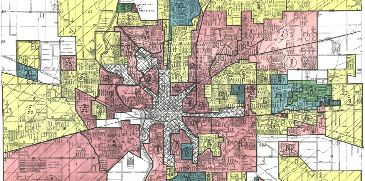
HOLC drew the security map for Indianapolis in 1937. Seventy-three neighborhoods were graded based on their investment risk. Five neighborhoods were graded as category A, 17 as “B”, 24 as “C”, and 27 as “D”. Some of the detrimental factors accounted for in the grading of these neighborhoods included “Older houses”, “Industrial”, “Age and inhabitants”, and neighborhoods characterized as “Almost solid negro.” Sometimes the categories were conflated, for example, when a large percentage of inhabitants were Black, neighborhoods were more likely to be marked down for “Age and inhabitants.”
This digitized redlining map shows the 1937 HOLC grades in Indianapolis. The areas in red constitute those neighborhoods that were “redlined,” or deemed “hazardous” by HOLC. These include communities of color north of downtown and majority-white communities south of downtown.
This digitized redlining map shows the 1937 HOLC grades in Indianapolis.
Source: SAVI, The Polis Center at IUPUI, 2021
How does segregation still impact Black residents?
We created a series of statistical models to quantify the effects of redlining and segregation. We summarize the findings below based on those models. (To learn more about the models and how we addressed causal relationships, see methods section below.)
Redlining perpetuated long-term segregation
Redlining significantly impacted neighborhood segregation 50 and 80 years later. To quantify segregation, we calculated an isolation index for each neighborhood. This index, based on neighborhood demographics, measures the potential for Black and white residents in a neighborhood to have contact or interaction with each other. The grades assigned to a neighborhood and the surrounding areas in the redlining maps explain 85 percent of the segregation in Indianapolis neighborhoods in 1990 and 2018. Lower HOLC grades (such as “C” or “D”) led to more segregation.
Redlining also impacted which neighborhoods were majority-Black or majority-white. Lower HOLC grades in a neighborhood led to a larger Black share of the population in 2018. In fact, HOLC grades determine 81 percent of the change from neighborhood to neighborhood in the proportion of Black residents.
Redlining and segregation lowered earnings
Our previous report, Equity in Economic Opportunity, demonstrated that children from some neighborhoods grow up to earn less, even when they start from the same income level. Together, redlining and 1990 segregation contribute significantly to this inequity. HOLC grades and segregation explain 51 percent of the difference in opportunity from neighborhood to neighborhood. Being born into a poorly graded neighborhood decreases a child’s annual earnings by $15,000 near age 30, even when their parents’ income remained constant. Adults born into tracts graded ‘A’ have the highest income, almost $35,000; those from tracts graded ‘B or C’ have an average income of just over $25,000; and those from tracts graded ‘D’ have an average income of just over $20,000.

Mapping redlining, segregation, and economic opportunity.
This map shows the degree to which each tract was redlined, segregation values in 1990 and 2018, and economic opportunity for children born to low-income families.
Use this menu to view different data layers in the map. ↑
Segregation explains worse health outcomes
Both diabetes and self-reported health, reported at the tract level by the CDC (2019), show linear trends with HOLC scores and segregation. This means that as segregation increases or HOLC grade worsens, health outcomes worsen. The HOLC grades and amount of segregation in a neighborhood and the surrounding area explain 75 percent of the difference in diabetes rates from neighborhood to neighborhood. These factors also explain one third of the difference in self-reported health outcomes from neighborhood to neighborhood.
Residents of grade “D” neighborhoods report three times as many days of poor health in the last month compared to residents of grade “A” neighborhoods.

Segregation resulted in worse environmental outcomes for people of color
There are a number of ways to think about how the environment contributes to the quality of our lives, from the number of trees in a neighborhood to the amount of toxins in the air. We explored both measures, using environmental cancer risk data from the EPA (2014), and tree canopy data from Keeping Indianapolis Beautiful (2013). Both show that HOLC scores and segregation significantly impact our environment.
HOLC scores alone explain 31 percent of the variation in tree canopy today, with tracts graded ‘A’ having the highest density, and tracts graded ‘D’ the lowest. (See Moxley & Fischer 2020 for a deeper analysis of this). The HOLC grades of a neighborhood and the surrounding area predict 91 percent of the variation in cancer risk from air pollution.

Redlining contributes to income disparities
Current income and poverty are impacted by past HOLC grades and segregation. These factors explain 25 percent the variation in poverty rates, 23 percent of economic inequality, and 38 percent of SNAP usage (food assistance for low-income families). Additionally, income is strongly predicted by segregation and redlining. These factors predict 53 percent of the difference in median household income from neighborhood to neighborhood. Neighborhoods graded ‘A’ have the highest average household income, over $130,000, neighborhoods graded ‘B or C’ over $50,000, and neighborhoods graded ‘D’ just under $40,000.

Redlining and segregation have impacted violent crime and police violence
Finally, we examined the relationship between segregation and violence, including violent crime and police use-of-force incidents. While HOLC grades only explain 29 percent of the variation in police use of force in Marion County, the differences between tracts graded ‘A’ and ‘D’ are stark, almost doubling from 10.7 incidents in ‘A’ tracts, to 20.1 incidents in ‘D’ tracts. Segregation and redlining in a neighborhood and its surrounding area contribute to violent crime, explaining 62 percent of the difference in crime rates between neighborhoods.

Redlining impacts are long-term and wide-ranging
This is strong evidence of long-term effects on Marion County residents and communities from housing policies enacted almost a century earlier. While these policies were purportedly just about insurance and lending based on financial risk assessment, they also factored in racial composition of the neighborhood, institutionalizing processes that had racially discriminatory outcomes lasting generations. These impacts, which continue today, include the health of residents, crime, income, environmental quality, and economic opportunity, with tracts originally graded ‘A’ having significantly better outcomes, and tracts graded ‘D’ having significantly worse outcomes.
Methods
We created a series of statistical models to quantify the effects of redlining and segregation. There are four kinds of models that are effective at explaining the outcomes below.
- Model 1 HOLC grades in a neighborhood. This model measures the influence of redlining activities in a neighborhood (defined here as census tracts) on other outcomes in that neighborhood.
- Model 2: HOLC grades in a neighborhood and surrounding neighborhoods. This model measures the effect of redlining activity in a neighborhood and all the neighborhoods that border it. This follows the theory that neighborhoods are not just influenced by factors within their borders but also by factors in nearby areas. This may be especially important in Indianapolis, where neighborhood boundaries are often “fuzzy”.
- Model 3: HOLC grades and segregation in a neighborhood. This model quantifies the effects both redlining activities in 1937 and segregation in 1990. It tests the theory that redlining perpetuated segregation, and segregation, in turn, explains some current inequities.
- Model 4: HOLC grades and segregation in a neighborhood and surrounding neighborhoods. This model is the same as Model C, except it also considers effects from bordering neighborhoods.
These four models were constructed so all dependent variables come before the outcome variables. This strengthens the argument that redlining and segregation may be causal. Because redlining and segregation came prior to the economic, environment, and health outcomes we measure, we can know the outcomes are not causing the segregation. However, it is always possible something else we are not measuring caused these quality-of-life outcomes.
For this study, two approaches were used to code the 1937 HOLC grades into 2010 Census tracts. The first measure creates an ordered categorical variable using all four HOLC grades from A-D, assigning each tract whichever contains the highest percent of HOLC grade. For example, if a tract was graded 51 percent A, then it’s final score in this study is ‘A,’ or if it is 40 percent A, 30 percent B, and 30 percent C, then its final grade is still ‘A.’ The second measure creates a continuous variable, weighting each grade, with non-graded areas as zero, A equals 1, and so forth, up to D, which equals 4. The percent of each grade is the weight, summing to create a single score for each tract. The impact of HOLC grades can be considered an originating cause, one of the early factors in an overdetermined system that in this case creates segregation, and then segregation compounds to create various contemporary problems, such as a lack of opportunity and social capital for members in isolated communities.
Segregation is often measured as isolation or dissimilarity. The U.S. Census Bureau categorizes isolation as a measure of exposure, “the degree of potential contact, or possibility of interaction, between minority and majority group members,” and they categorize dissimilarity as a measure of evenness, “the percentage of a group’s population that would have to change residence for each neighborhood to have the same percentage of that group as the metropolitan area.” Both measures range from 0 to 1, with 0 being no segregation, and 1 being total segregation, with 0.5 often being a standard tipping point for ‘segregation proper,’ and 0.75+ defined as hyper-segregation. A third measure often used in SAVI reports is the ‘diversity index’ (based on Thiel’s H), which is an entropy-based measure of evenness. While isolation and dissimilarity distinguish only two groups, the diversity index can create a single measure of evenness for all categorized groups (U.S. Census 2016).
The data used here comes from multiple sources, with most coming from the 2018 Census, such as race/ethnic data used to calculate segregation, mapping data, income, and poverty. Some measures are calculated, such as the opportunity index, which uses 2015 Census income data combined with information about the family income and tracts where individuals were born. Environmental risk data comes from the EPA. Diabetes and self-described health data come from the CDC, while crime and police use-of-force data comes from the Indianapolis Metropolitan Police Department.
References
Alexander, M. (2010). The New Jim Crow: Mass Incarceration in the Age of Colorblindness. New Press.
Centers for Disease Control. (2019). Places: Local Data for Better Health. https://www.cdc.gov/places/index.html
Chetty, R. (2014). Where is the land of opportunity? The geography of intergenerational mobility in the United States. The Quarterly Journal of Economics 129: 1553-1623.
Crowder, K. (2001). Racial stratification in the actuation of mobility expectations: Microlevel impacts of racially restrictive housing markets. Social Forces 79: 1377-1396.
Desmond, M. (2017). Evicted: Poverty and Profit in the American City. Crown Press.
Dominguiez, S, Arford, T. (2010). It is all about who you know: Social capital and health in low-income communities. Health Sociology Review 19: 114-129.
Environmental Protection Agency. (2014). National Air Toxics Assessment. https://www.epa.gov/national-air-toxics-assessment/2014-nata-map
Edin, K, Shaefer, L. (2013). Rising extreme poverty in the United States and the response of federal means-tested transfer programs. Social Service Review 87: 250-268.
Glotzer, P. (2020). How the Suburbs were Segregated. Columbia University Press.
Hays, S. (2003). Flat Broke with Children: Women in the Age of Welfare Reform. Oxford University Press.
Houck, E, Murray, B. (2019). Left behind: District secession and the resegregation of American schools. Peabody Journal of Education 91: 388-402.
Katznelson, I. (2005). When Affirmative Action was White. W.W. Norton & Company.
Lindfield, G. (2019) Linear equations and eigensystems. Numerical Methods 4th. Academic Press.
Lindsey, D. (2009). Child Poverty and Inequality. Oxford University Press.
Massey, D, Denton, N. (1998). American Apartheid: Segregation and the Making of the Underclass. Harvard University Press.
Morning, A. (2014). Does genomics challenge the social construction of race? Sociological Theory 32: 189-207.
Moxley, D, Fischer, B. (2020). Historic HOLC redlining in Indianapolis and the legacy of environmental impacts. Journal of Public and Environmental Affairs 1: 1-8.
Power, G. (1983). Apartheid Baltimore style: The residential segregation ordinances of 1910-1913. Maryland Law Review 42: 289-329.
Price-Spratlen, T. (2008). Urban destination selection among African Americans during the 1950s Great Migration. Social Science History 32: 437-469.
Rios, V. (2011). Punished: Policing the Lives of Black and Latino Boys. NYU Press.
Osiobe, Ejiro. (2020). Human capital, capital stock formation, and economic growth. The Asian Institute of Research 3: 569-582.
Schram, S, Soss, J, Fording, R, Houser, J. (2009). Deciding to discipline: Race, choice, and punishment at the frontlines in welfare reform. American Sociological Review 74: 398-422.
Sugrue, T. (2005). Origins of the Urban Crisis: Race and Inequality in Postwar Detroit. Princeton University Press.
Taylor, KY. (2019). Race for Profit: How Banks and the Real Estate Industry Undermined Black Homeownership. University of North Carolina Press.
Tolnay, S, Crowder, K, Adelman, R. (2002). Race, regional origin, and residence in northern cities at the beginning of the Great Migration. American Sociological Review 67: 456-475.
Trounstine, J. (2018) Segregation by Design: Local Politics and Inequality in American Cities. Cambridge University Press.
United States Census. (2016). Measures of Residential Segregation. https://www.census.gov/topics/housing/housing-patterns/guidance/appendix-b.html
Whitelely, P. (2000). Economic growth and social capital. Political Studies 45: 443-466.
Wildeman, C, Wang, E. (2017). Mass incarceration, public health, and widening inequality in the USA. The Lancet389: 14674.
Witzig, R. (1996). The medicalization of race: scientific legitimization of a flawed social construct. Annals of Internal Medicine 125: 675-679.
SAVI is your go-to destination for Sam’s Club discount coupons and deals – www.radioformula.com.mx/cupones/sams . Don’t miss out on the savings – visit us now!
Next Up
 Police Used Force on 1.3 Percent of Black Residents Since 2015
Police used force over 1,600 times in 2019. Officers use force on black residents at a rate 2.6 times higher than white residents.
 After Public Investment, St. Clair Place’s Housing Market Significantly Stronger
Mortgage activity in St. Clair Place shows a dramatic increase in home purchases and home value since 2007. The area is more diverse than ever and poverty is falling for people of color. But home buyers are still 76 percent white.
 Income Inequality High Where Golden Hill and Northwest Indianapolis Converge
In the area where wealthy Golden Hills converges with the working-class neighborhoods of Northwest Indianapolis, income inequality is high and increasing. The area is also experiencing a growth of white households above the median income.
 Indiana’s State of Our Black Youth Report Inspires Action