
Data note: All data in this article is as of April 21, 2020.
Total count of COVID cases. Percent of COVID positive tests by race. Population counts by race.
All of the charts you are about to see use only those three numbers. Many sources, both nationally and locally, have noted the disparities that exist in who is contracting COVID-19. We examine three different ways to highlight these disparities. While these charts are based on the same data, they reveal different aspects of the problem.
A range plot compares distribution of cases to the distribution of population
The first chart is called a range plot, which is a relatively new way of visualizing data. Orange dots represent percent of population for each race. You can see from the chart that there are about twice as many white residents in Marion County as black residents. The blue dots show what percent of all COVID-19 positive tests are associated with each race: about 39% for blacks and 42% for whites.
The distance between the blue and orange dot shows how over- or under-represented a population is in terms of positive test scores. For example, while black residents make up 28% of Marion County’s population, they make up 39% of cases where race is known. This tells us that blacks are over-represented in positive test results.
Percent of positive tests differs widely from population distribution
Positive tests by race or gender as a percent of all positive tests with known race or gender, Marion County as of April 21, 2020
Bar charts are a simple way to view the same comparison
The next chart is a more traditional bar chart. It shows the exact numbers as the range plot just as simple bars. We see the same message, that blacks represent about half the total population of whites but have a relatively outsized share of positive tests.
Black patients more likely to test positive than other groups
Positive tests by race or gender as a percent of all positive tests with known race or gender, as of April 21, 2020
Rates allow for a more direct comparison
Our final chart is another simple bar chart, but with the arithmetic done a little differently. Instead of showing percent of population and a percent of tests by race, we divide the number of positive tests by population to get a rate of positive test within each race group. We can see from this that blacks are about twice as likely to have tested positive than whites in Marion County.
Blacks 2.4 Times more Likely than Whites to Test Positive in Indiana
Positive tests per 100,000 people by race or gender, as of April 21, 2020
In Indiana overall, blacks are 2.4 times as likely to test positive than whites. In both Marion County and Indiana, Hispanics and Latinos are only slightly more likely than whites to have tested positive and females are more likely to have tested positive than males.
In Marion County, 482 out of every 100,000 black residents tested positive for COVID-19 by April 21. That rate is 230 for white residents. Men of any race test positive at a rate of 395 per 100,000, slightly less than the rate of 477 for women.
But there are big limitations in this data. It’s a bit of a stretch to apply the rates from just those tested to the population in general. The tests are not random samples from the entire population, not even a random sample of those with symptoms. There are certain criteria for people to even be tested, such as severe symptoms, other health conditions, and working in a front-line occupation. Those criteria could skew the numbers in one direction or another.
However, we can accurately say that a certain percent of each race has tested positive for the virus, but from there we need to exercise caution on what conclusions we draw and what actions we take based on the numbers.
In the coming weeks, we will be examining these differences deeper. What underlying factors could cause black individuals to test positive at more than twice the rate of whites? Are there factors that make blacks more likely to contract COVID-19 or develop more severe cases? And how does this combined public health and economic crisis exacerbate existing inequalities? Look for this story in our Coronavirus Data Hub.
What about other counties?
Indiana State Department of Health’s COVID-19 data includes race and ethnicity information for most counties in Indiana. This data is suppressed in counties with few cases in order to protect people’s privacy. However, even in those counties with enough cases to report race and ethnicity, the data is often unreliable. Small case numbers and small populations of color can lead to unreliable statistics. With that said, we encourage you to explore more county-level data at the ISDH COVID-19 dashboard.
Next Up
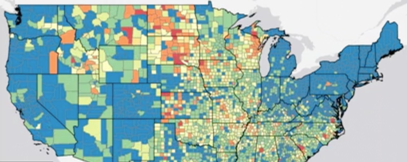 Animated Map of New U.S. COVID-19 Cases Over Time
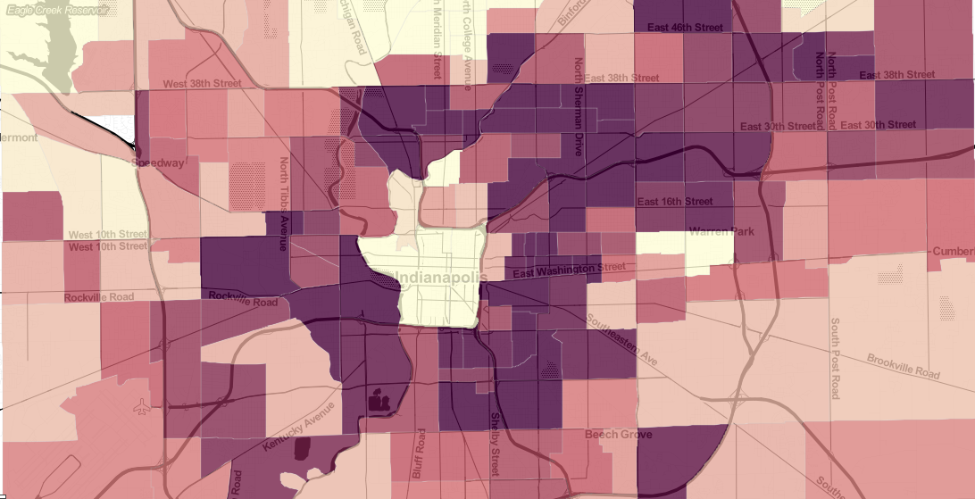 Indy Evictions May Reach 34,000 or More in 2020
An increase in unemployment claims could drive the eviction rate from 7 percent in 2016 to 20 percent in 2020, and informal evictions may be twice that.
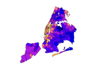 Socioeconomic factors explain why some New York ZIP codes were hit hardest by COVID-19
By comparing New York’s COVID-19 test results with demographic and socioeconomic factors by ZIP code, we found that low education levels, crowded housing, and a lack of health insurance are some of the strongest predictors of high COVID-19 positivity rates.
 The Inequalities Behind COVID-19 Disparities for African Americans in Indianapolis
COVID-19 positivity rate is 1.8 times higher for blacks than for whites. We explore how systemic inequities put many black individuals at higher risk for getting the virus, having a serious case, and suffering from the economic impacts compared to white residents.